Livelii Mortgage Product
Independent workers in Canada face obstacles getting a mortgage. This project explored how Livelii might offer a competitive mortgage product that would support the lifestyle and financial needs of Canadians who are self-employed or work as independent contractors.
#Product Design #Qualitative Research #Quantative Research #Visual Design #Prototype
Overview
This project I did in my field placement with Livelii was short but ambitious. This case study shows how initial ideas for the mortgage product changed and grew based on user research and how what we learned from that research became a testable concept prototype.
Role
- Research
- Wireframing
- Visual Design
- Prototyping
Duration
- 2 Weeks
Tools
- Figma
- Miro
- Pen & Paper
- Google Docs
- Google Meet
Methods
- Interviews
- Survey
- User Journey
- Wireframing
- Design Thinking
Process
The product manager and I designed a research plan to validate our assumptions about client needs and design a user journey based on gained insights. I collected data on Livelii’s customer base by conducting virtual interviews and a survey, applying Lean UX and Design Studio methods to create a product prototype that would help company leadership better understand the market.
Phase 1: Empathize & Define
To understand this problem space, we wanted to validate assumptions that we had going into this project. We began by writing down our assumptions and brainstorming some protopersonas. Responses from my interviews and survey, as well as research into competing mortgage products, gave me a more nuanced understanding of our client's needs and motivations.
I identified our assumptions by writing them out as hypotheses.
Was there really a need for this product? That's we needed to find out.
We believe that Livelii can provide affordable mortgage options to independent workers in Canada who would otherwise pay higher interest rates or be denied mortgages by traditional lenders.
We believe that Livelii’s marketplace and community board will help independent workers in the Livelii network feel more confident in buying a home by being able to share first-hand experiences and learn more about the home-buying process for independents.
It was important to put down we thought we knew about our potential clients.
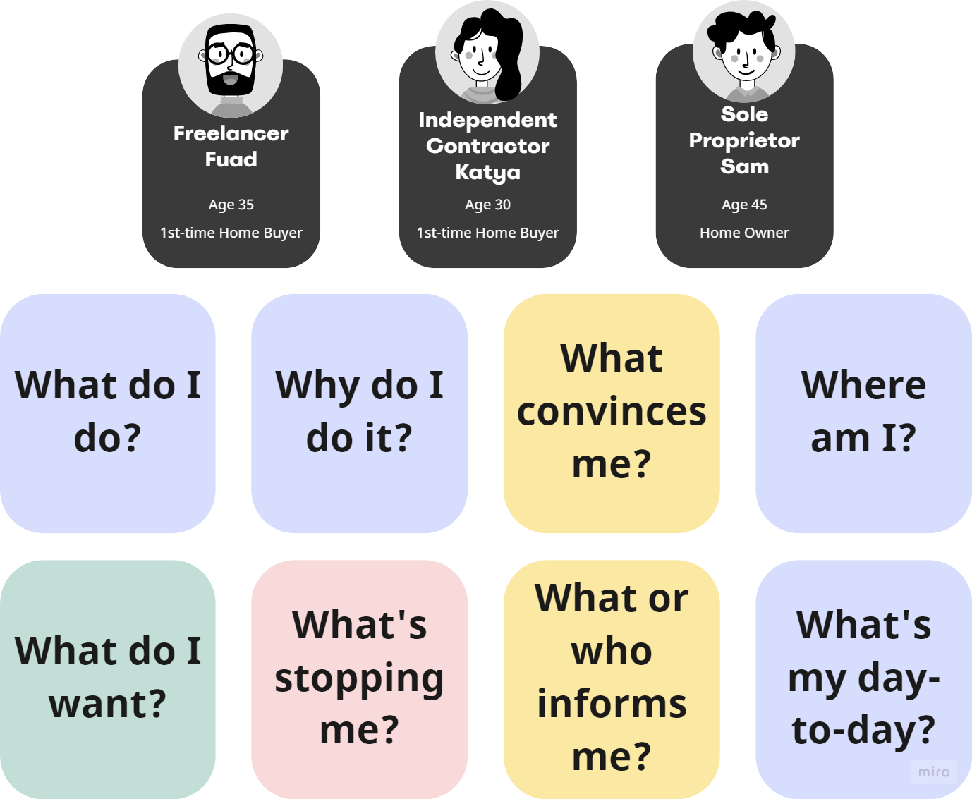
To do this, I created three protopersonas, representing three different types of independent workers: freelancers, independent contractors, and sole proprietors. Asking myself basic questions about these types of clients helped me see the gaps in my knowledge.
What we heard from independent workers:
I interviewed a few of Livelii's clients to gain a clearer picture of their experiences with personal finances, planning toward home ownership, and applying for mortgages. To complement this qualitative research, I also designed a survey to help me understand where our target clients might be coming from and what they wanted.
Takeaways
- Independent workers may find it hard to show income because of how they receive income.
- B-level mortgage lenders and brokers do not offer low enough mortgage rates.
- Brokers and lenders don’t cater to independent workers.
- Information about mortgages for independent contractors isn't as accessible as it is for traditional paid employees.
- Young independent workers need to save money before applying for a mortgage. They're not ready to buy a house yet.
- Some face challenges with credit scores.
The personas took shape.
I built three protopersonas around information available online from government websites and other mortgage lenders. These early personas helped me prepare interview and survey questions. We decided to focus on two personas based on our two interview participants.
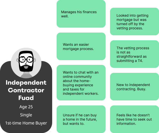
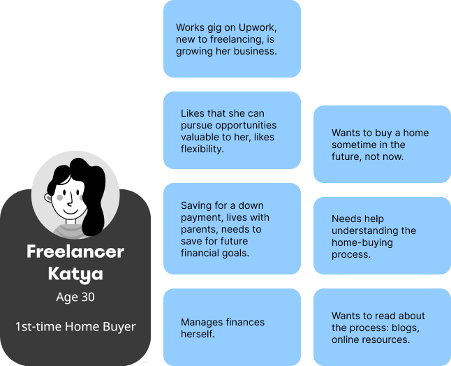
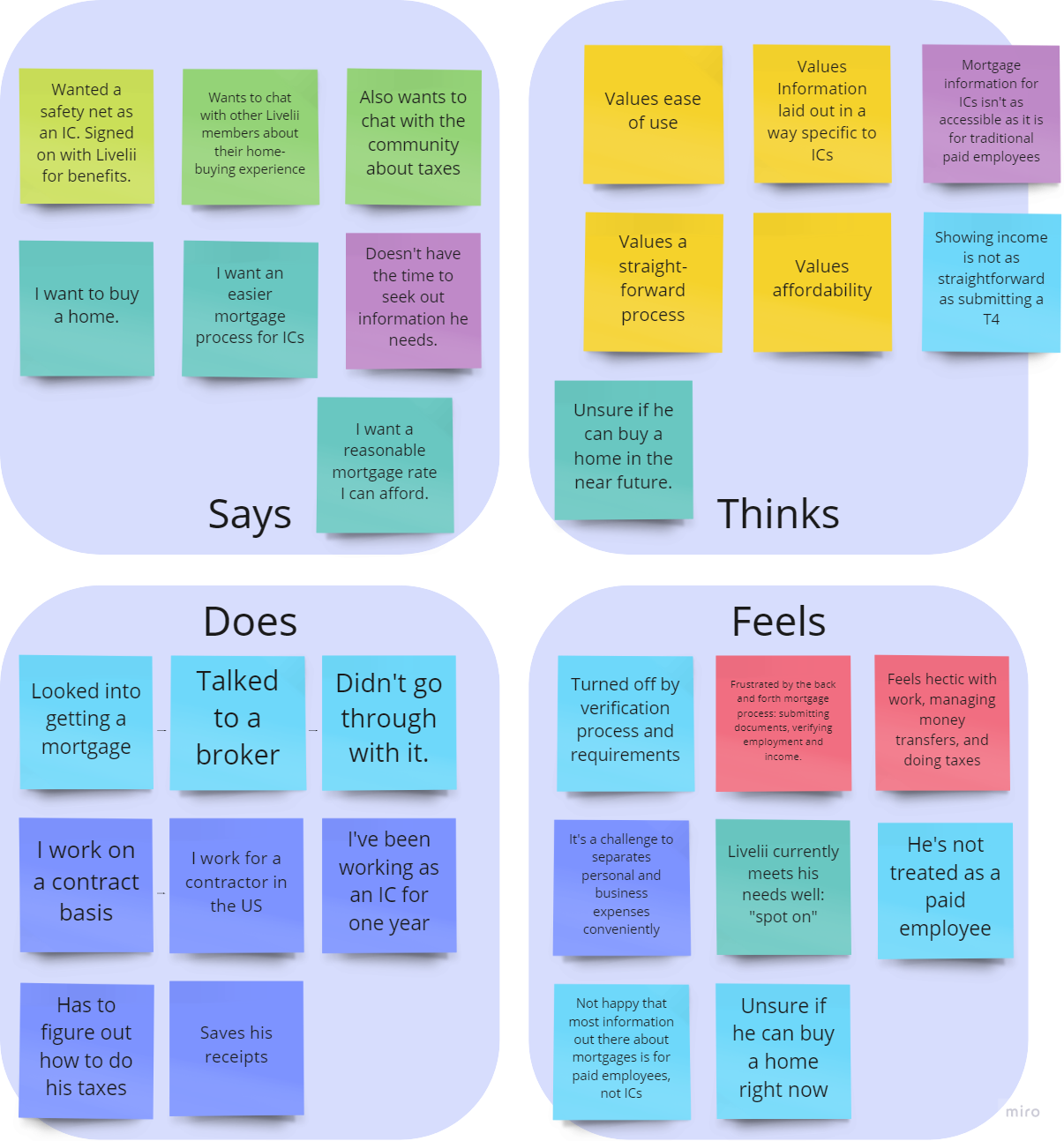
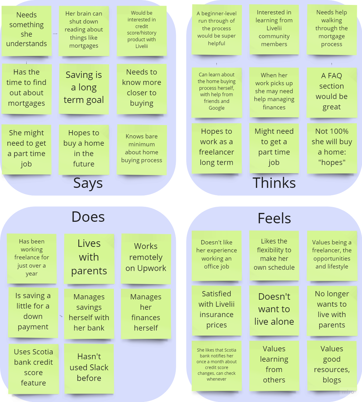
I used empathy maps to look for insights.
To gain some clarity around our personas’ needs and goals, I took our interview responses and sorted them into the empathy map categories of say, think, do, and feel.
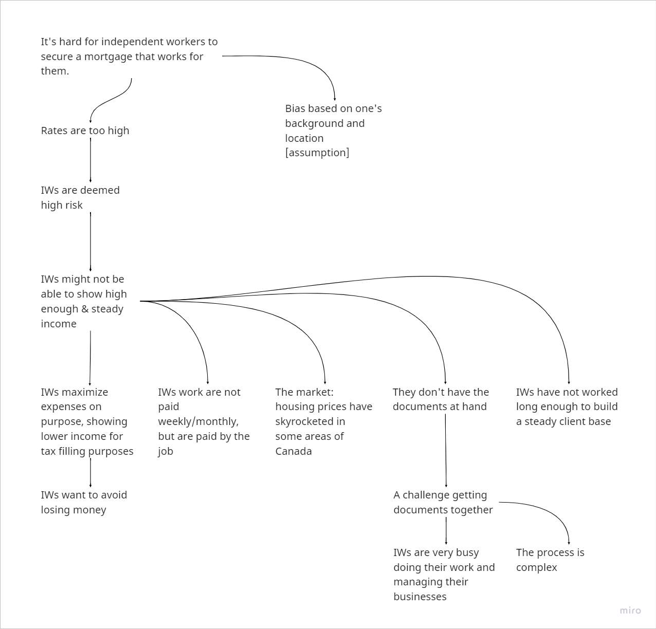
Thinking through the 5 WHYs helped me get at the root of our personas' needs.
Using a 5 WHYs Analysis, I wanted to put my finger on why it’s hard for independent workers to secure a mortgage that works for them so that we could target those root challenges in our product design.
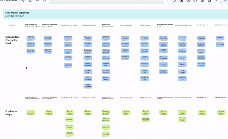
I wanted to understand context with an expanded 5 Ws Matrix.
To piece together the bigger picture for this mortgage product, I took a traditional 5 Ws Matrix and expanded it, adding multiple questions for each who, what, how, when, why, where category.
Phase 2: Ideate and Prototype
Based on what I had learned from my research and exploration of this problem space, I put a name to the features that would address our users’ needs. My end goal for this project was to design a prototype for a mortgage lending website that I could use to present the product idea to company leadership. To get there, I laid out a user journey and corresponding information architecture for the user flows on the website.
How Might We questions set the agenda for the product.
To better see and articulate how the mortgage product could address specific user needs, I wrote several How Might We questions.
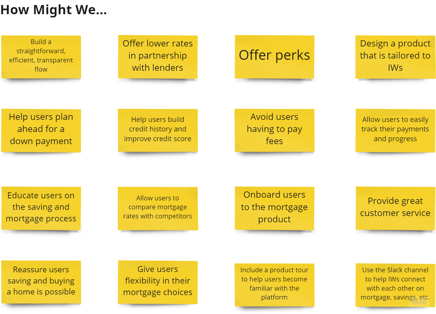
From there, we chose three additional areas of focus.
Our primary goal would be to offer competitive mortgage rates and mortgage application process tailored to the unique situations of independent workers in Canada. To support that goal, we decided it was important to add supports that could stand as products on their own.
- Help users plan ahead for a down payment.
- Help users build credit history and improve credit score.
- Let users easily track their payments and progress.
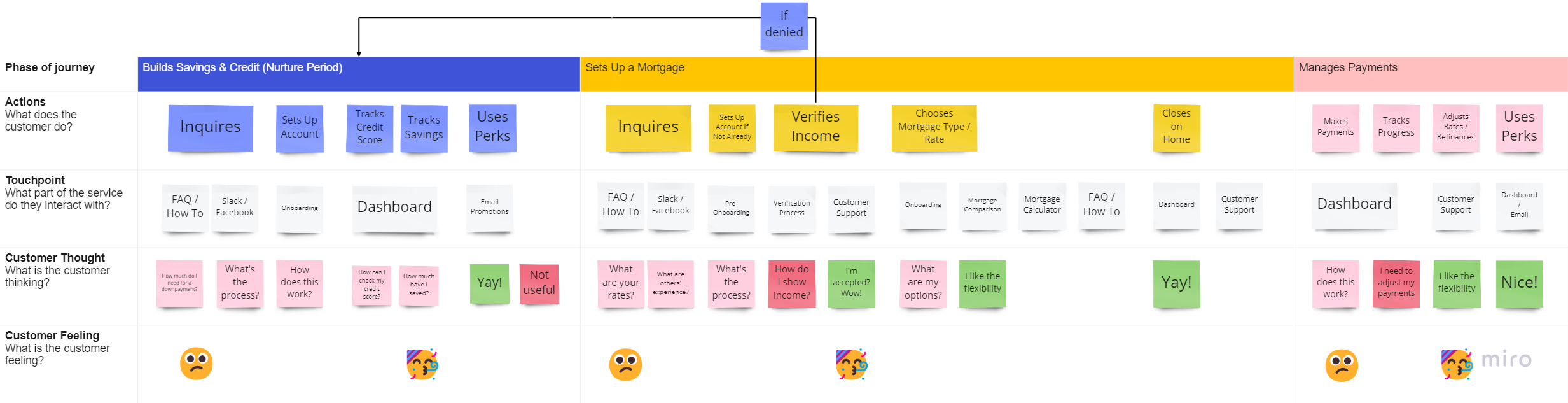
Our user journey keeps people connected to the Livelii marketplace.
The user journey shows how independent workers who can’t afford to buy a home could still benefit from Livelii services. The company would help them build credit and save for a downpayment, making it easier for them to apply for a mortgage down the road.
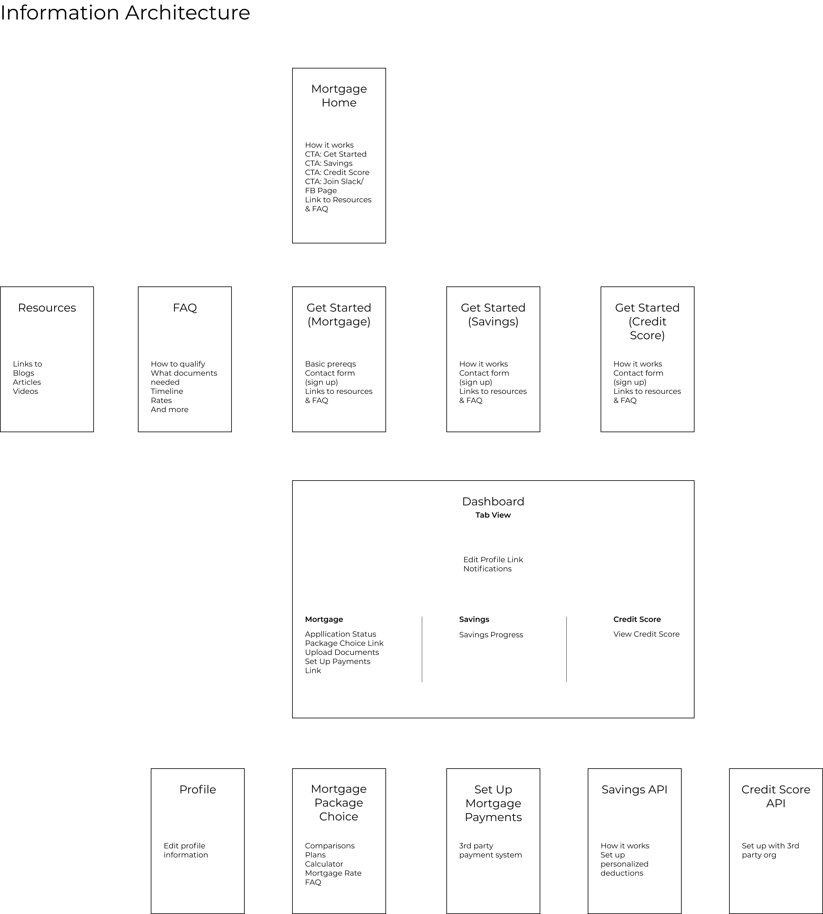
The information architecture communicates and enables this user journey.
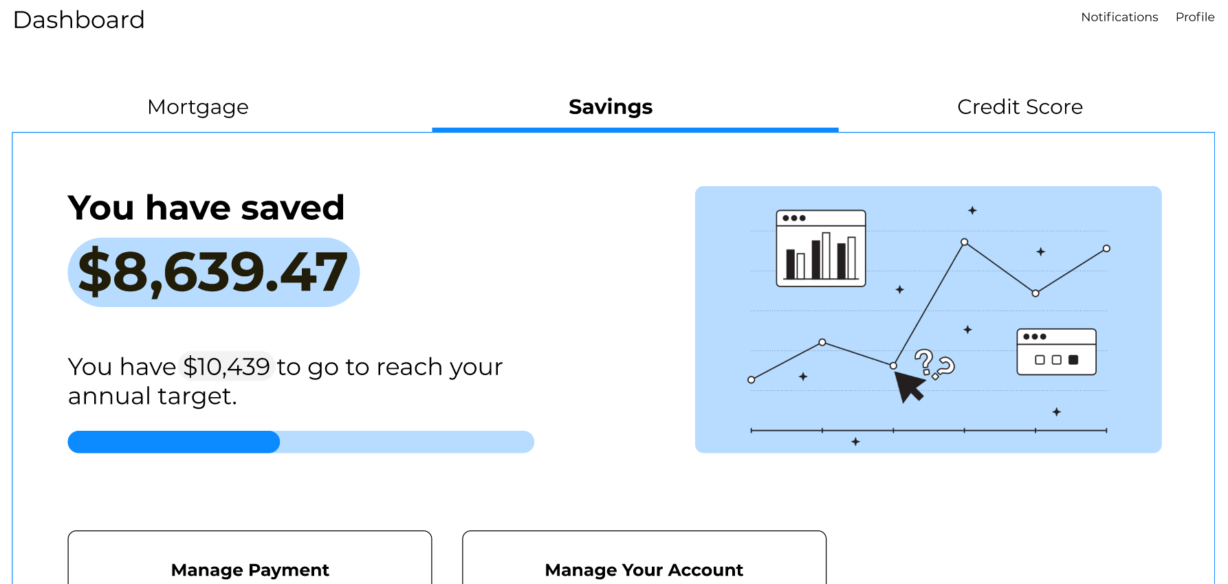
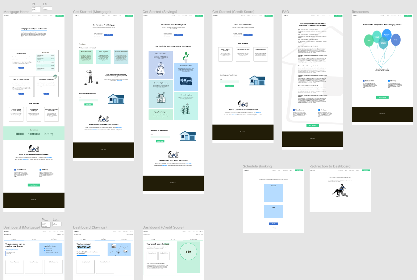
I created a basic layout for the website’s information architecture to visualize how users would navigate our primary user flows and move through the user journey. The website needed to help potential customers understand the three tracks available to them—mortgage, savings, and credit score—and set up an appointment with a customer representative.
I also worked out the information architecture for a dashboard prototype. The dashboard is a portal where customers can submit documents, track their savings or credit score, and interact with the company.
Low fidelity wireframes focused on visual layout.
In my low fidelity wireframes, I focused on some ground-level visual design choices: typescript, spacing, and placement of information and how those would enable navigation
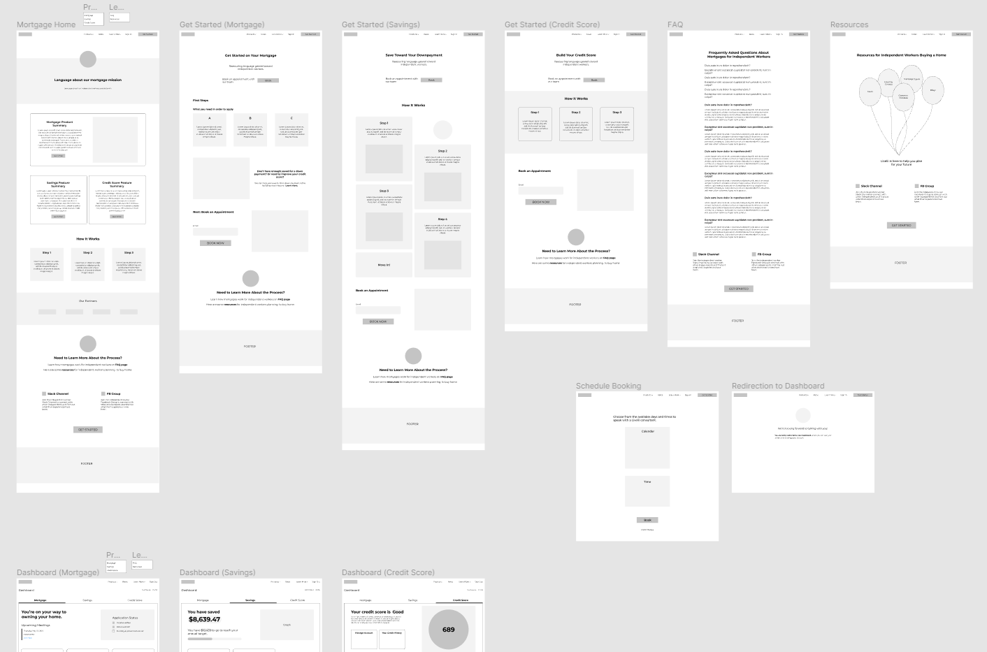
High fidelity mockups focused on use of color and images.
In my high fidelity mockups, I considered how a color scheme would reinforce design. I chose calm, analogous colors associated with stability and trustworthiness that wouldn’t compete for attention with the text. The images I included also are intended to support the text.
Reflections & Takeaways
My final deliverable was a clickable Figma prototype that I used to demonstrate the product concept to company leadership. This prototype could then ideally be used to continue testing hypotheses about this product. I believe that visual design and creativity are just one side of making a successful product. These aspects of design work best when they support the more brainy things such as information architecture, user flows, and user interactions. Not only should these conceptual things be tested in the design process but aesthetic choices should as well.
Would you like to know more about this project?
This case study is an overview of the work I did for this project. If you're interested in learning more about this project, please contact me by email or through LinkedIn.