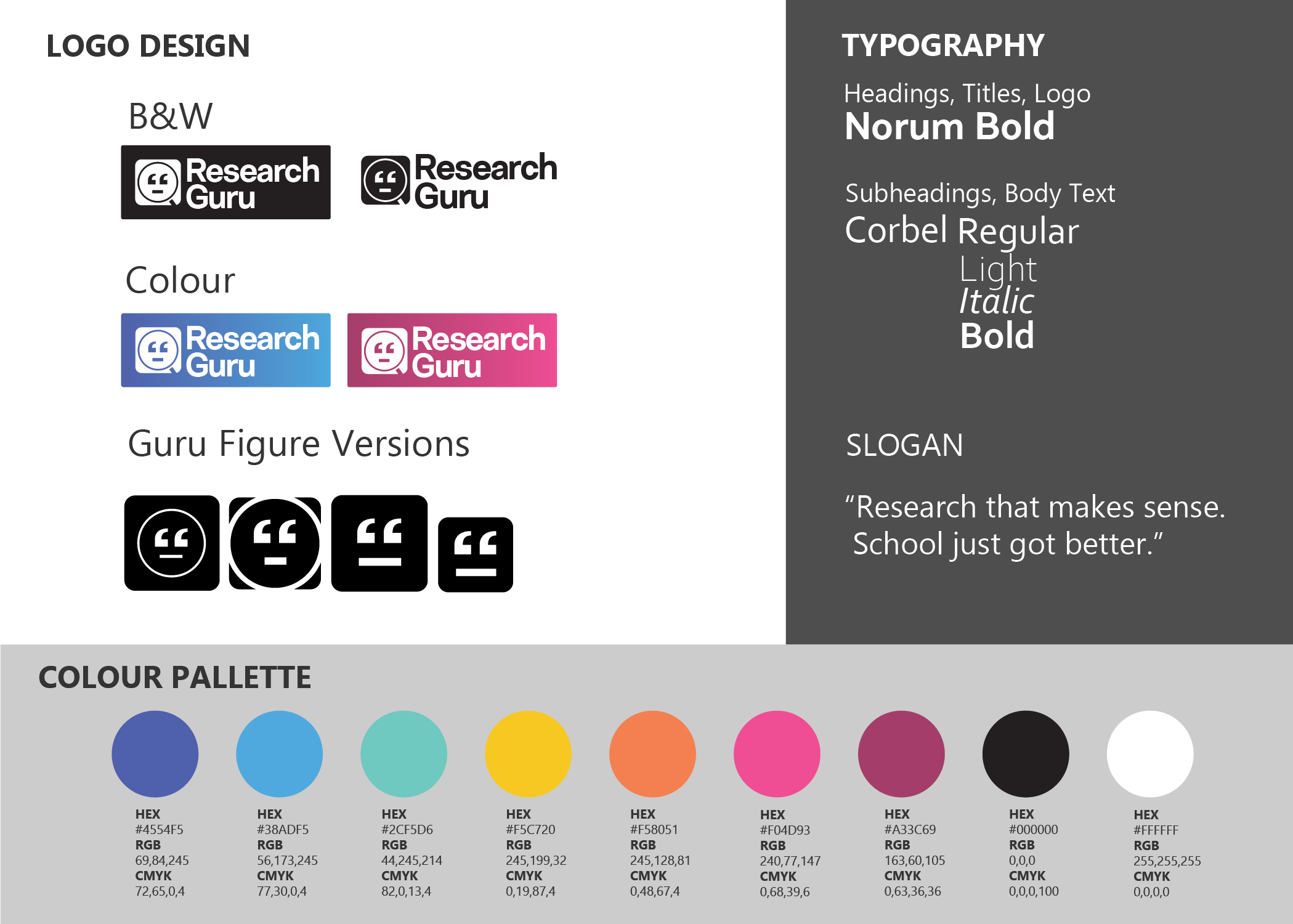
Research Guru
In this concept-to-prototype solo project, I created a concept app that helps college students navigate the intimidating and sometimes frustrating process of finding sources for their papers. In addition to the process of research and design, this project also involved making an original logo and a marketing website for the product (using only HTML and CSS).
#Product Design #Qualitative Research #Usability Tests #Visual Design #Prototype
Overview
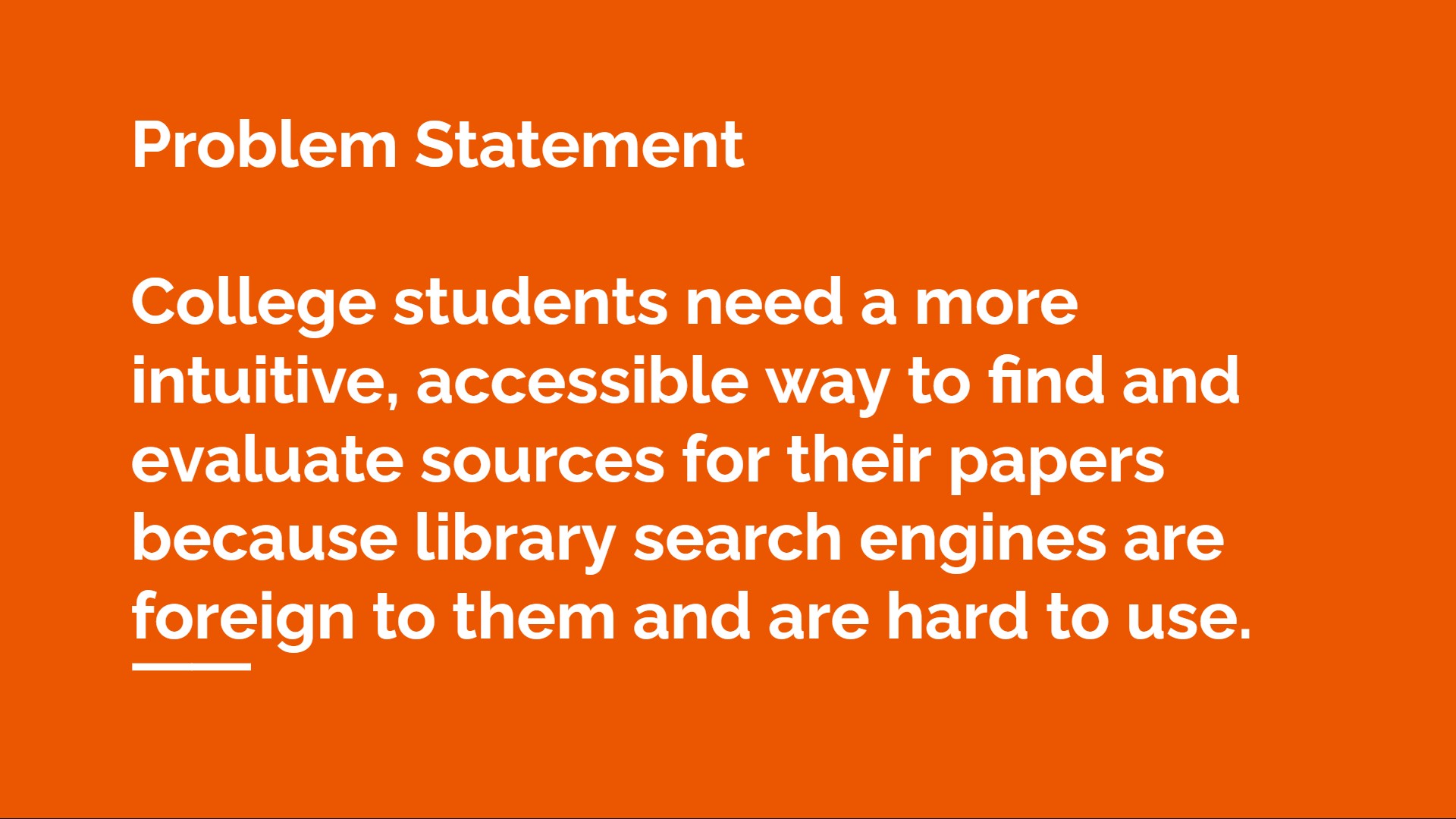
Research Guru is a concept app designed for college students who need a more intuitive, accessible way to find and evaluate sources for their papers. Students often do not know how to use the array of online search tools available to them and don't know how to distinguish one source from another. The app helps them think about their search parameters and also generates keywords based on their research question. The advanced search tools are also easy to use. The app doesn't spoon feed results, but instead helps students learn the fundamentals of research.
Role
- Research
- Wireframing
- Visual Design
- Branding
- Web Marketing
- Prototyping
Duration
- 6 Weeks
Tools
- Adobe XD
- Adobe Illustrator
- Pen & Paper
- HTML & CSS
Methods
- Interviews
- Usability Testing
- Wireframing
- Design Thinking
Process
This project followed the Design Thinking process, beginning with the steps Empathize and Define (Phase 1) and moving through the steps Ideate and Prototype (Phase 2). In this case study, I describe how I came to define a problem statement through my research and then design a prototype that is ready for testing.
Phase 1: Empathize & Define
To understand this problem space, I wanted to validate assumptions that I had going into this project. I wanted to design for both students and teachers. This app would not only help students do research but would also reinforce learning goals that college instructors might set for their students. I interviewed a college instructor as well as former students to pick their brains about their experiences in this area. I also conducted usability studies on library websites and analyzed existing research apps on the market to understand what my designs could do differently.
My Starting Point: Teaching
I worked as a college writing instructor at a community college in the US. Many of my students
came to their first semester of college with little exposure to academic research and writing.
It was a whole new world to them. I saw that my students avoided using the library search engine to
find academic sources, instead relying on Google. They struggled to distinguish academic sources
from popular sources, journal articles from blogs.
I realized that my college library’s “search engine”—and most other college library “search
engines”— are designed around the idea that users already know how to use those tools. But
there are too many options, too many strange words. Students not only struggle to grasp concepts
about research, but they struggle to understand the tools colleges are giving them to do research.
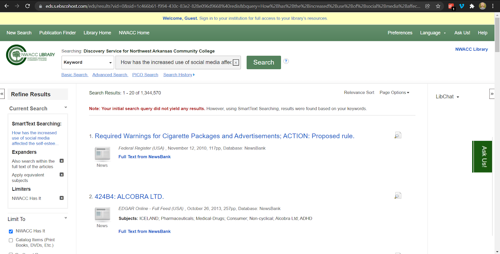
Usability Study
I asked two college students to search for sources using the Conestoga College Library and the Northwest Arkansas Community College Library* websites. My reason for doing this was to help me identify user needs and pain points that I could address in my designs.
*The UI of the NWACC Library page has been updated since my project was completed.
What stood out from the usability study
- One participant confused “advanced search” with a menu that filters results by source type.
- Neither participant used the Advanced Search feature.
- It took one participant four tries before he found the results he needed. He kept changing the keywords he was using to search with until he found what he was looking for.
- I wonder if students use these library websites like a slot machine, not realizing that they can have more control over the output of the search. It doesn’t seem like those advanced tools are used.
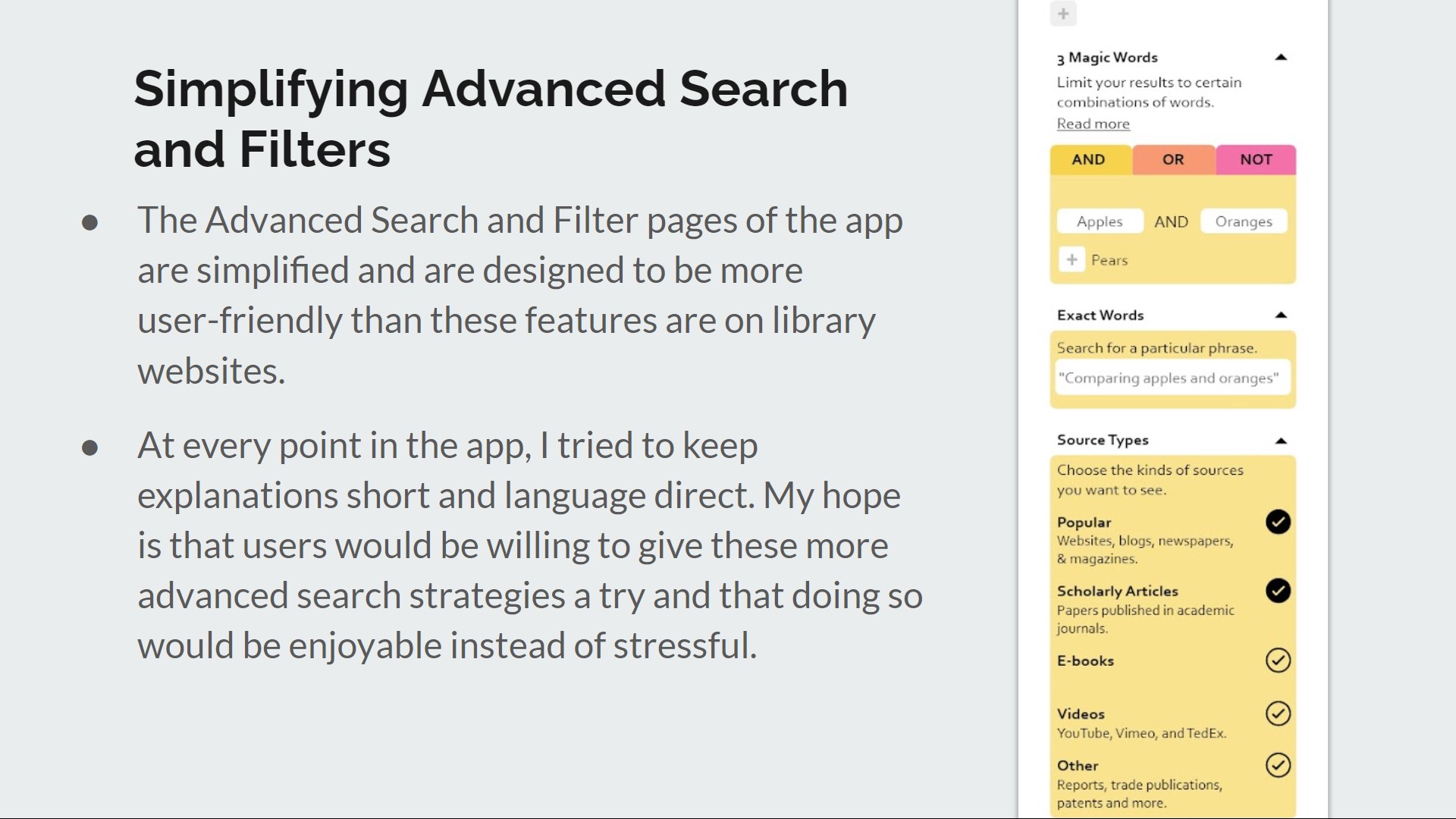
Based on this usability study, I asked myself how I might improve the accessibility and user experience of advanced search tools and how I might design the app so that users would not have to use advanced search tools to find what they need, if they preferred not to.
Interviews with College Graduates
I interviewed the same two usability study participants about their experiences doing research for humanities courses in college. My notes from the interviews are available here.
Takeaways from the interviews
- Not all students do a lot of academic research that requires using a library search engine during college, especially if they are in the hard sciences.
- These two guys wanted to get results quickly. They’re used to the efficiency and usability of Google and prefer that level of user experience.
- One of them is frustrated at how slightly different keyword searches yield really different results. A library website search is not optimized to find what you need without a lot of effort on your part as a user.
- They both like learning things and enjoy finding that perfect source that works for their paper or leads them further in their research.
Interview with a stakeholder—a college instructor
I interviewed a college writing instructor who teaches at Conestoga College. She and I talked about how she teaches students to do research and what she emphasizes in the process. I shared my ideas about a research app and what services it might provide to students.
Takeaways from the interview
- She wants students to be able to distinguish credible sources from non-credible sources rather than focus on the differences between scholarly and popular sources.
- She said students shouldn’t get help from an app to develop a research question. Developing a research question takes practice; it’s all about strengthening the thinking process.
- When using library search engines, she teaches students to use limiters, keywords, and dates.
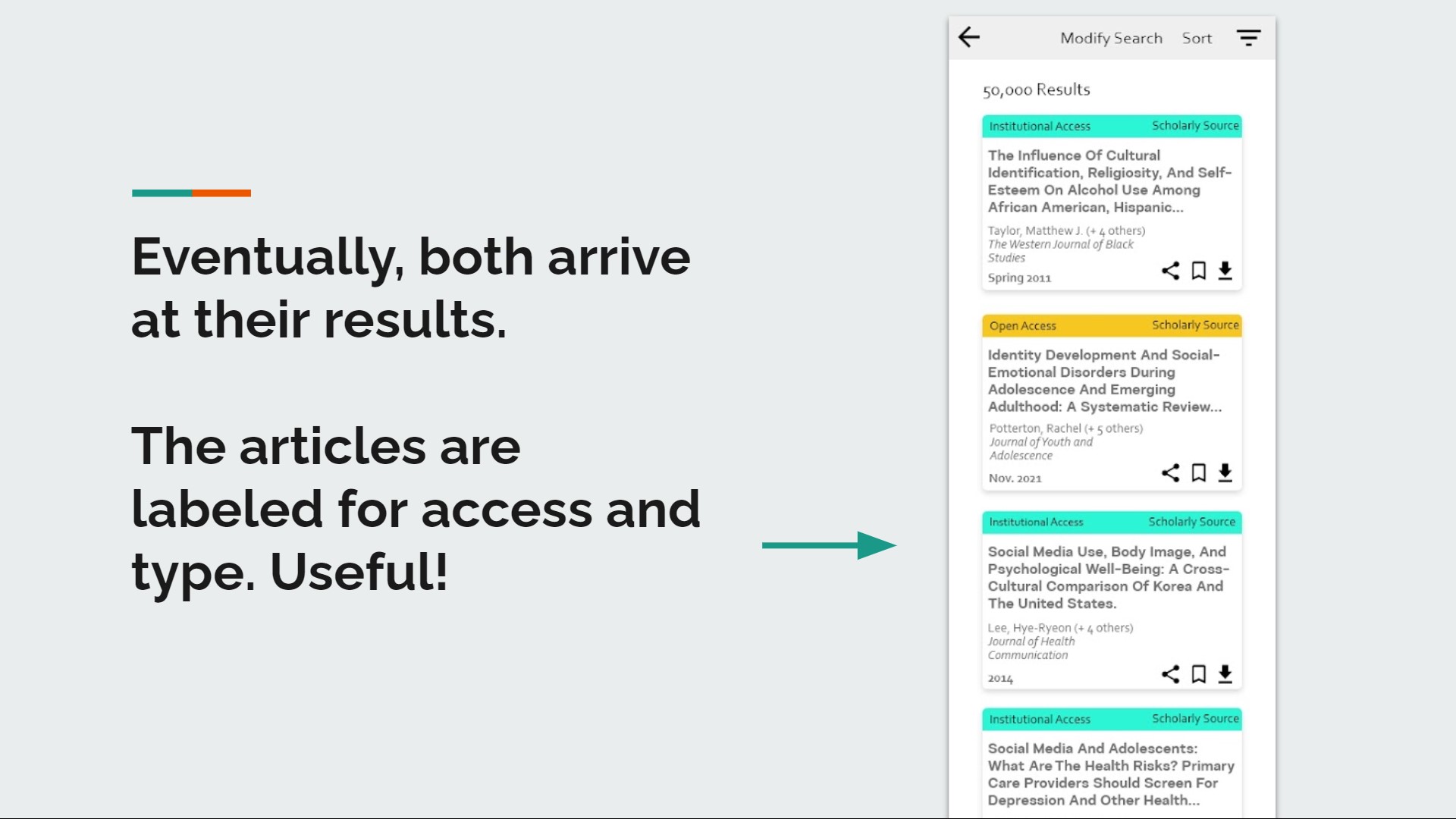
- When viewing search results, she directs students to the visual cues (icons/images) associated with source type.
Secondary Reading
I read “Assessing the Scope and Feasibility of First-Year Students’ Research Paper Topics” by Erin Rinto, Melissa Bowles-Terry, and Ariel J. Santos, published in College & Research Libraries in 2016, to see how I might design an app rooted in pedagogical theory.
What stood out to me
- Developing a good research question is essential for students to be successful in their research and writing.
- Students struggle to understand what a good research question is. This takes practice and scaffolding support.
- A good research question has researchability, appropriate breadth, language context, and arguability. These categories were used to assess student writing in the article.
Based on this reading, I asked myself, how might an app provide scaffolding support to students to write good research questions based on these criteria?
Competitive Research of 6 Existing Apps on the Market
Knowing that academic research apps already exist, I downloaded and explored their user flows and read their reviews on Google Play and the Apple App Store, evaluating their strengths and weaknesses. I wanted to know how I might draw from features that work well and improve on designs that seemed not to.
R Discovery: Academic Research
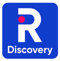
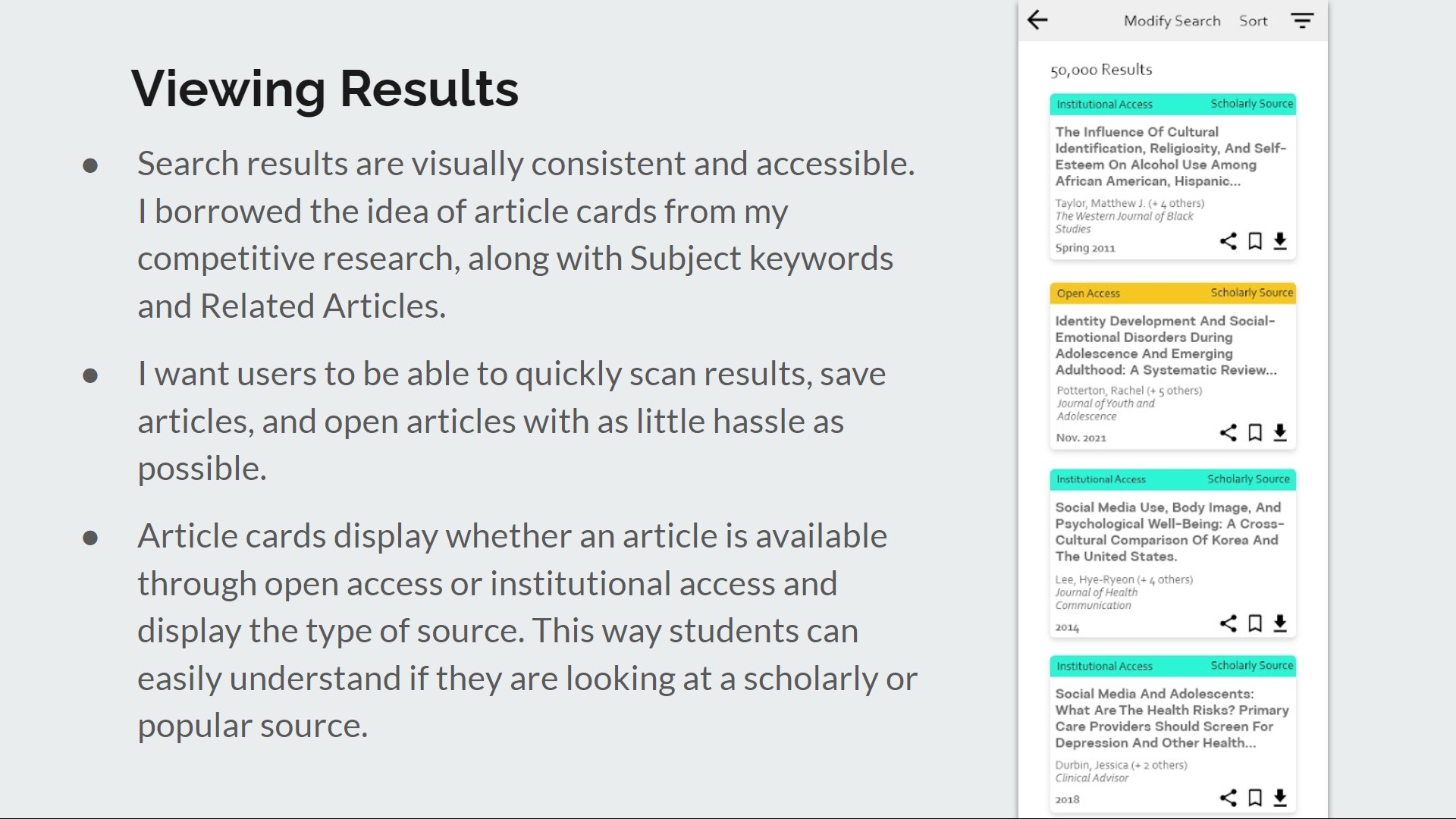
- The app lists sources in a kind of card format, which helps visually organize complex texts on a small screen.
- The app includes subject keywords with every source.
- The Feed feature appeals to more advanced students and researchers who already have experience with this.
- Searching “concepts” is confusing.
Paperity: Open Academic Papers Reader App

- The app works smoothly and really has something to offer as a portal to open-access academic articles.
- Focuses on science and medicine.
- Ease of search is a plus. Opens PDFs in app. But you can’t edit or download the PDFs.
- Shows related articles for the article being viewed.
Researcher: Discover and Discuss
- This is a serious, work-horse app. Includes keyword search tool, syncing with reference managers, institutional access, and a feed.
- The long onboarding seems unnecessary to me.
- In the app reviews, users want recommendations for articles their interested in.
Libby

- This app has many moments of delight, especially in it’s visual design, although the UI is not consistently great.
- The ability to read offline is a nice feature.
- The onboarding and sign-in process is enjoyable.
- But the app is slow and has unneeded visual effects.
Paperpile
- This app is has good organization and annotation features.
- One downside is that there is no advanced search feature.
- Takes a while to load screens.
Academia.edu
- The UI is clean and professional and well done.
- Some notable features are the save-to-library button and in-house PDF viewer.
- There are limited free features. Not great for students.
- No institutional login. Limited search terms.
As neared the end of my first phase of research, I worked at distilling the various pain points into my problem statement.
Phase 2: Ideate and Prototype
Having defined the problem, I asked myself What features could effectively address the needs and frustrations of students and teachers? In this section, I first explain what those features are and then share the steps of my design process—the user flow, sketches, wireframes, visual design, and branding.
From a business and technical perspective—
- The app is both customer-facing and B2B.
- It works in partnership with universities, colleges, and secondary schools so that students can have simplified access to academic databases.
- The app does not replace librarians and the important work they do.
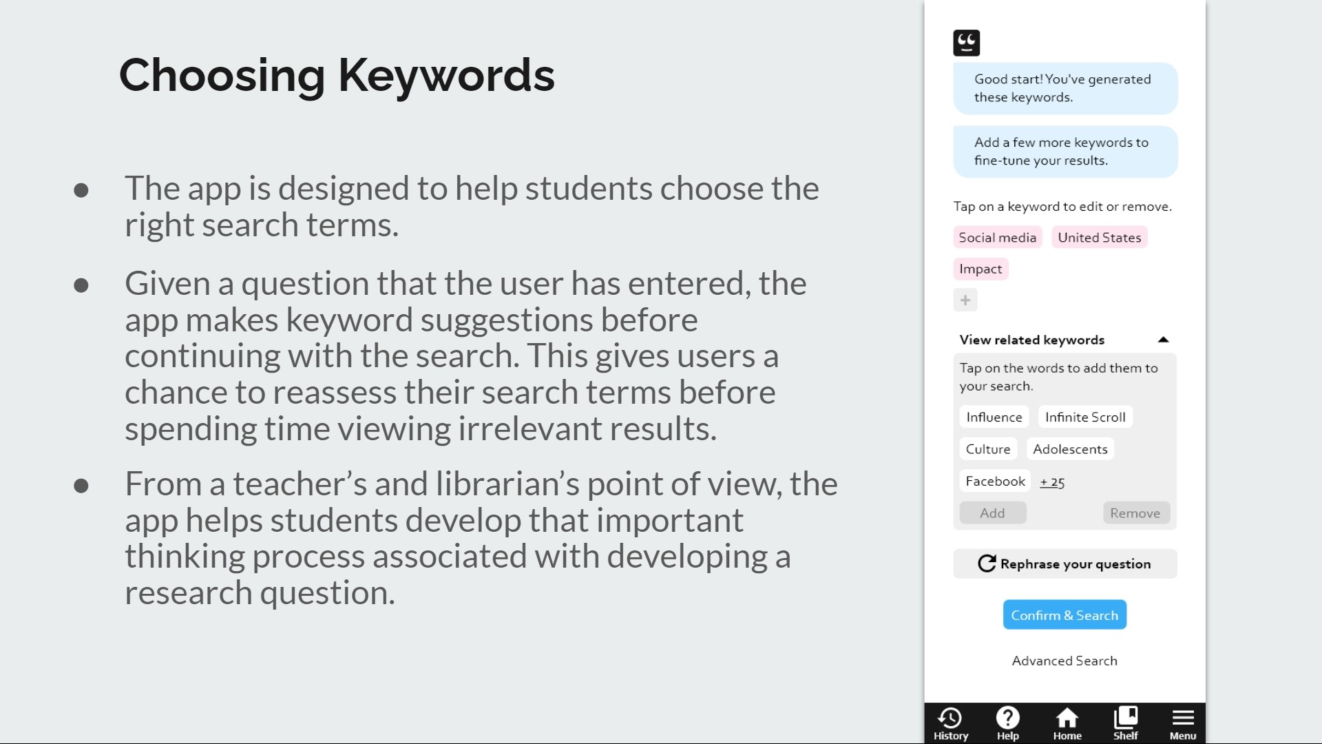
- Research Guru uses Smart Text Search to generate keywords from user input.
User Stories
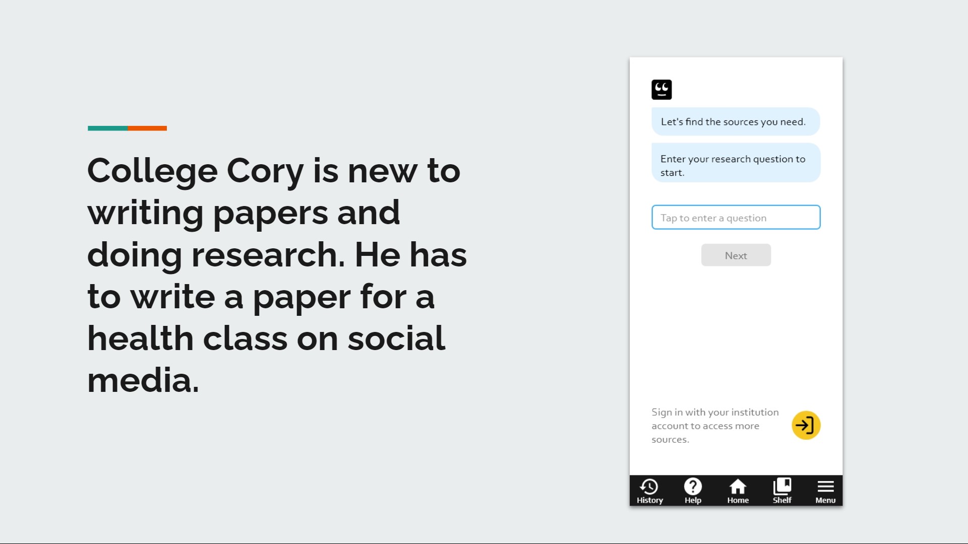
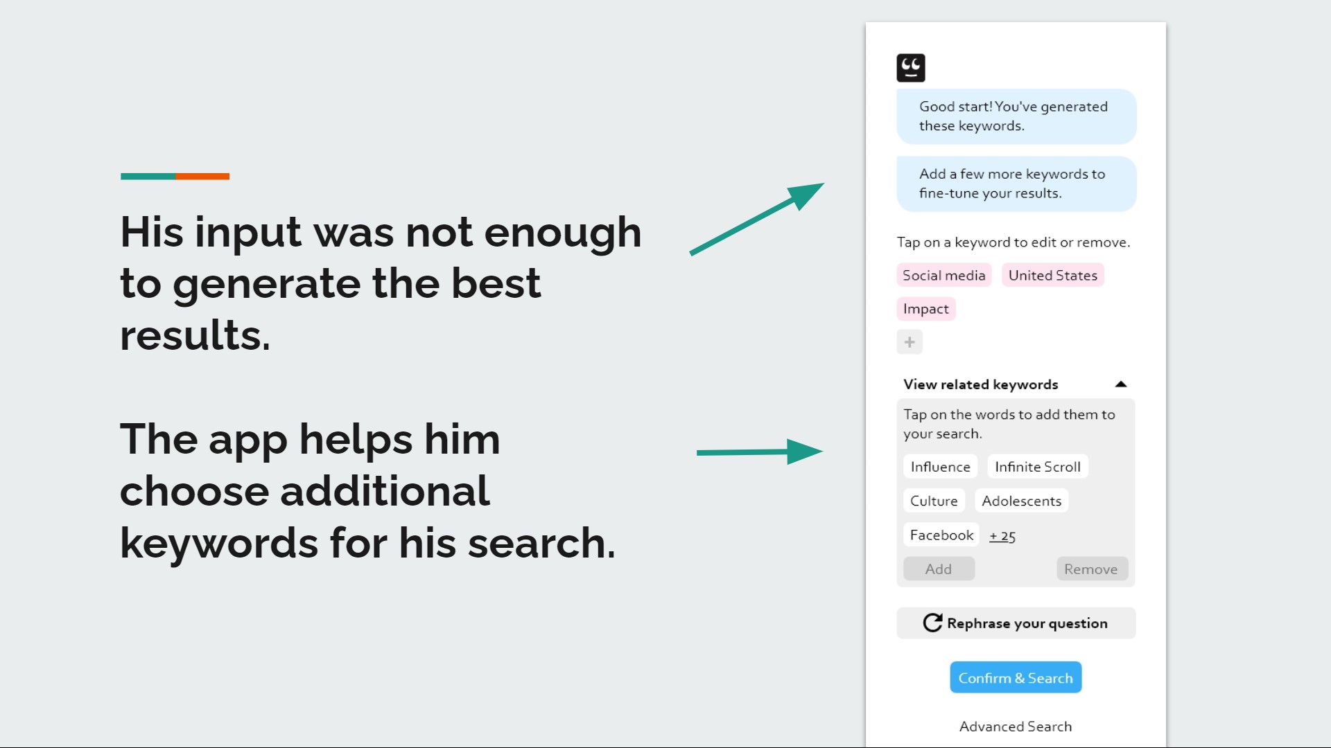
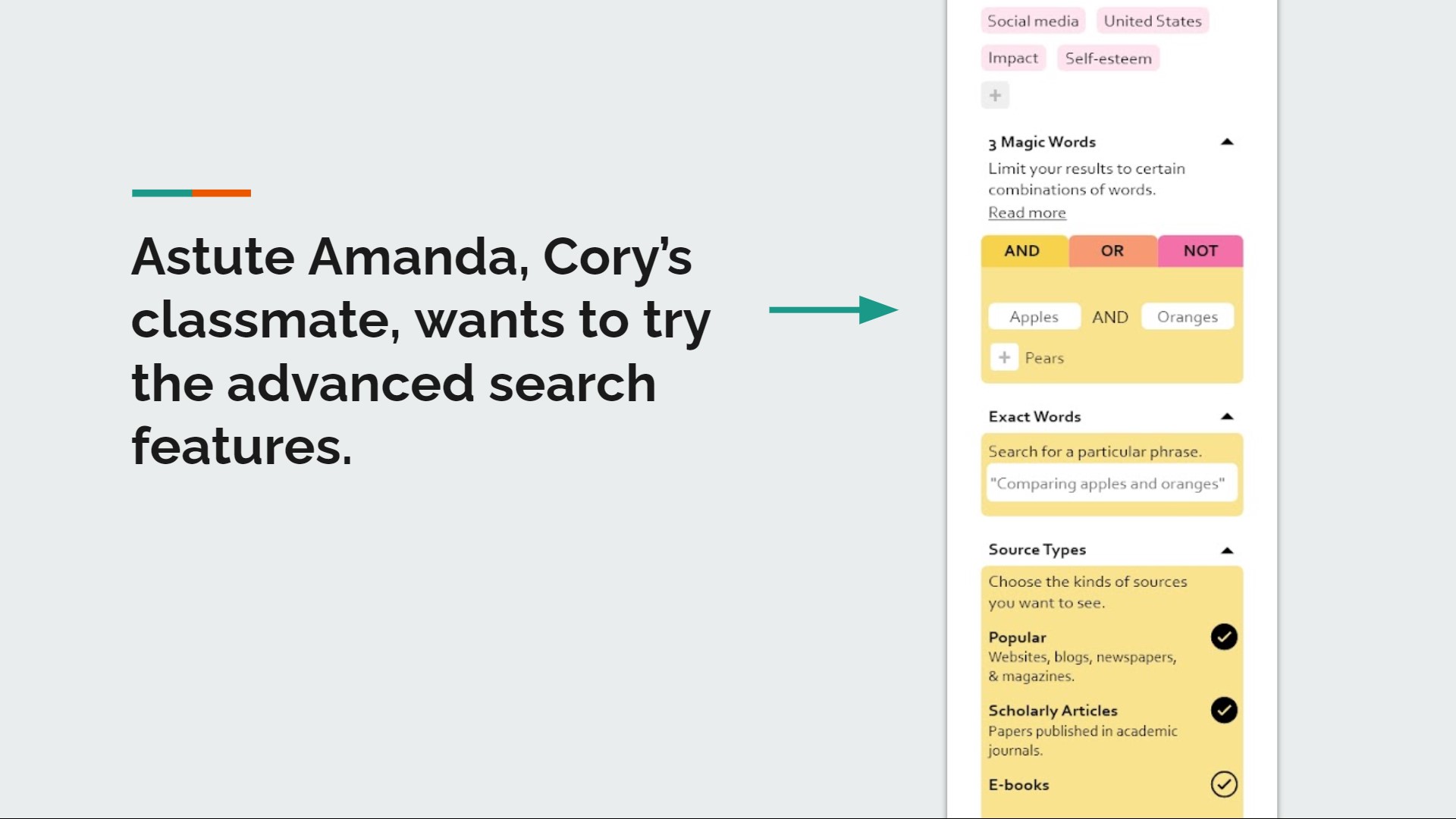
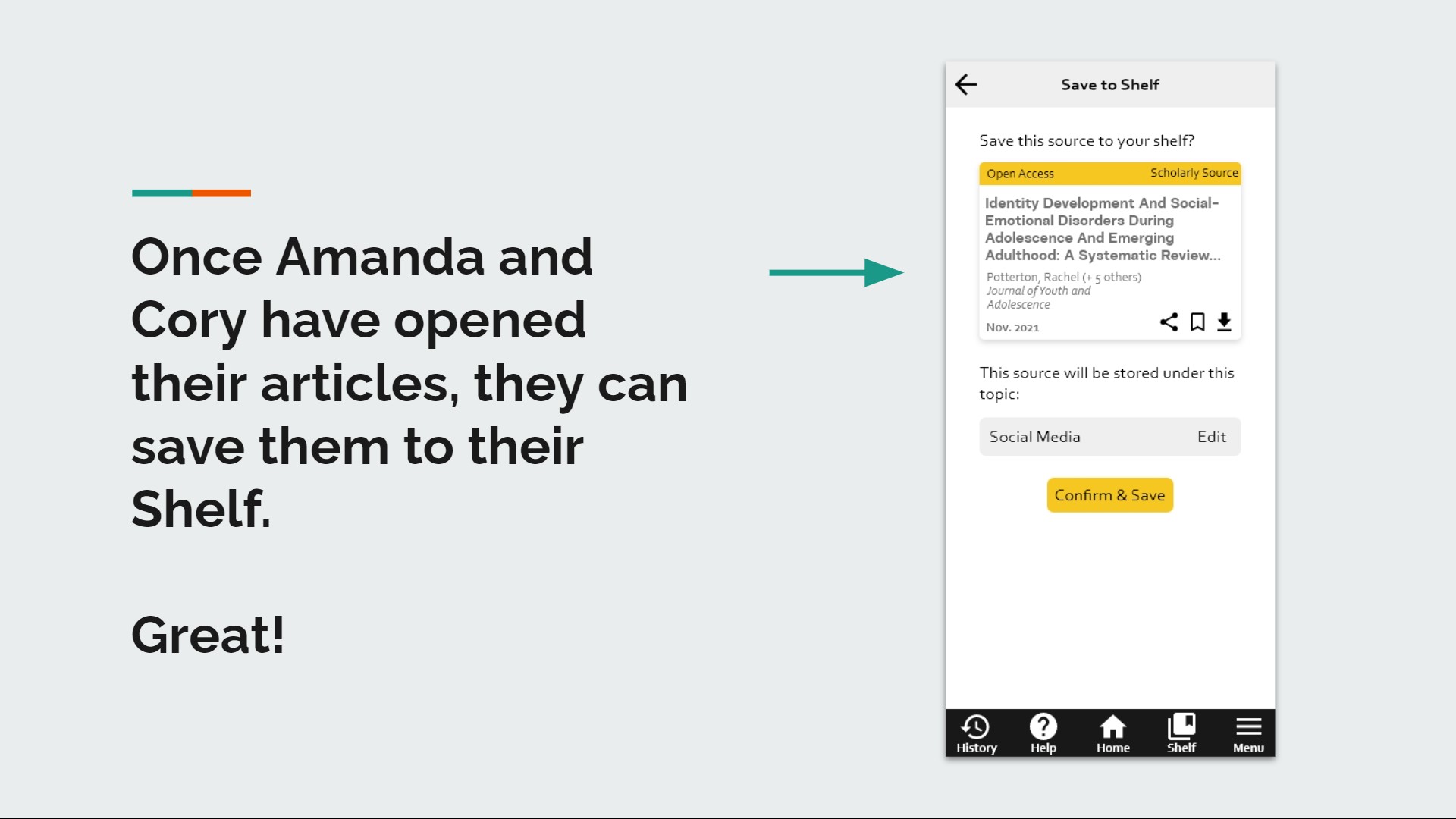
These user stories show how two personas, College Cory and Astute Amanda, use features in the app. College Cory needs help formulating a good research question, while Astute Amanda wants to use the advanced search features to narrow her search results.
Diving Deeper
Based on insights from my research, I focused on building three features in the prototype: keyword suggestions, simplified advanced search tools, and easy-to-understand search results. Below, I share my rationale for those three focal points in the app.
Designing a Prototype
Although my design process was not as linear as it appears here, I kept to a method to help me anticipate as many details as I could. After some ideation, I created a user flow, sketched low fidelity wireframes, fleshed those sketches out into digital medium fidelity, and finished with a high fidelity clickable prototype.
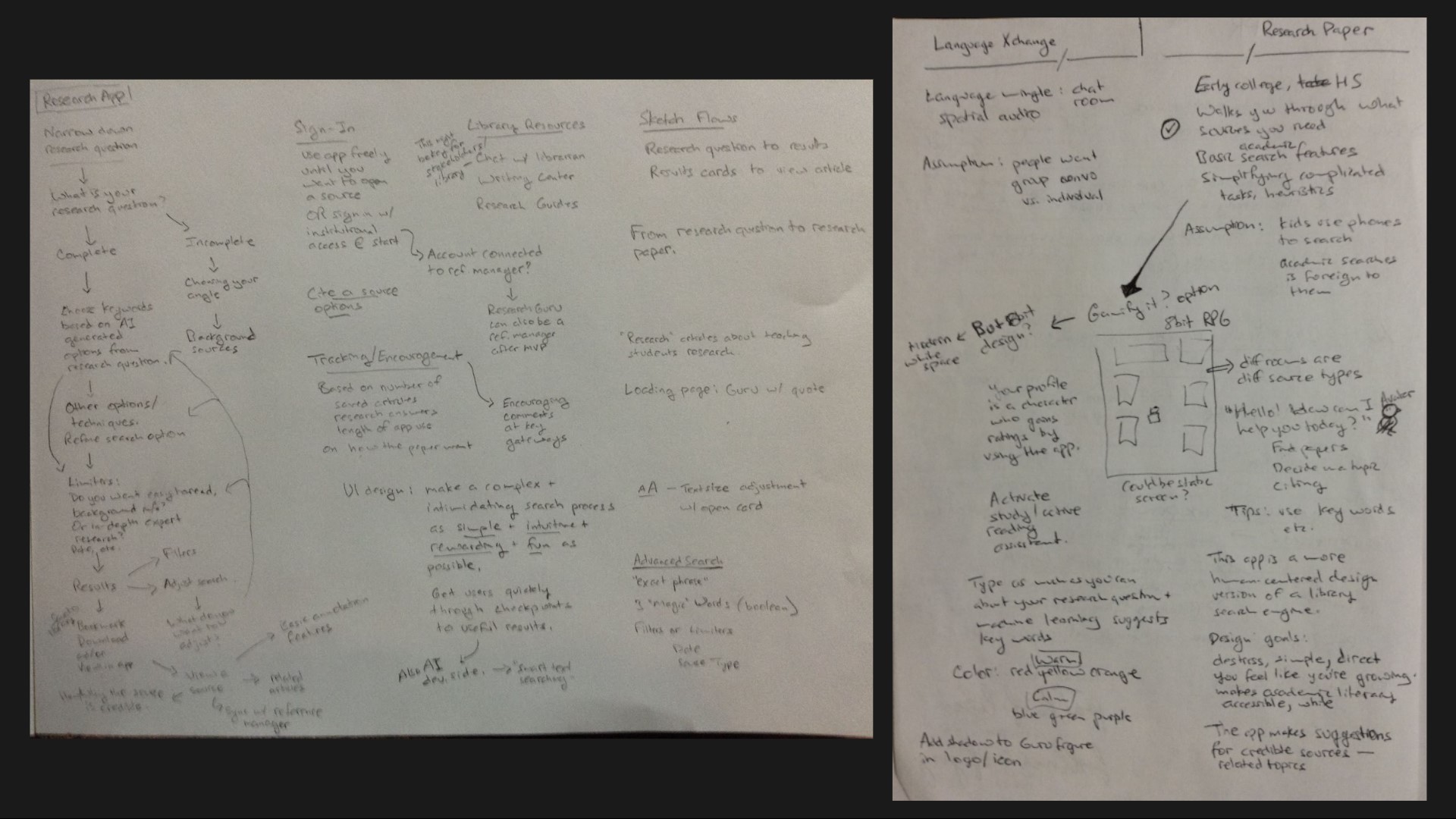
Ideation
I like to generate ideas using mind maps—lots of scribbles and arrows. Here you can see how I've done this in my notes.
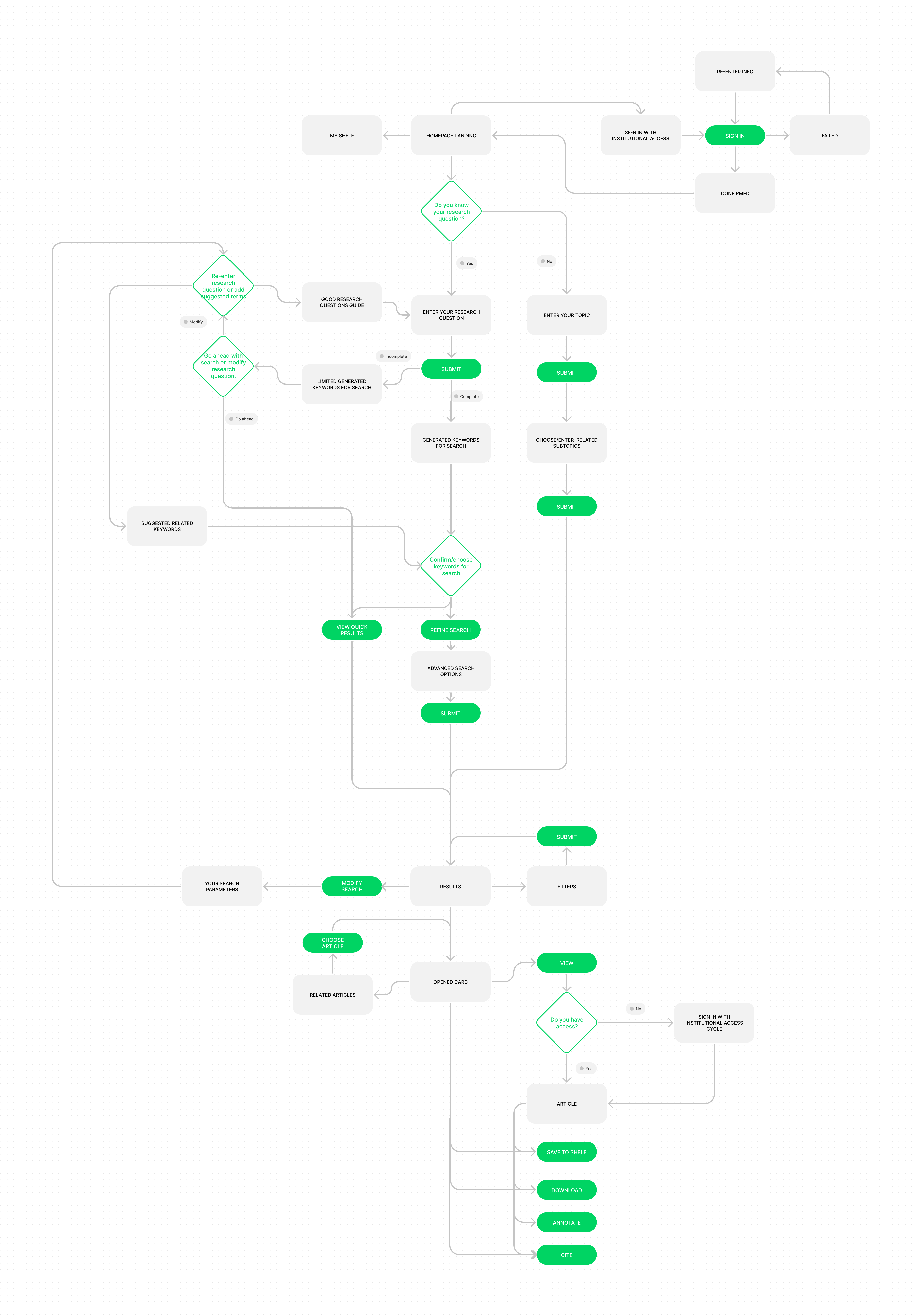
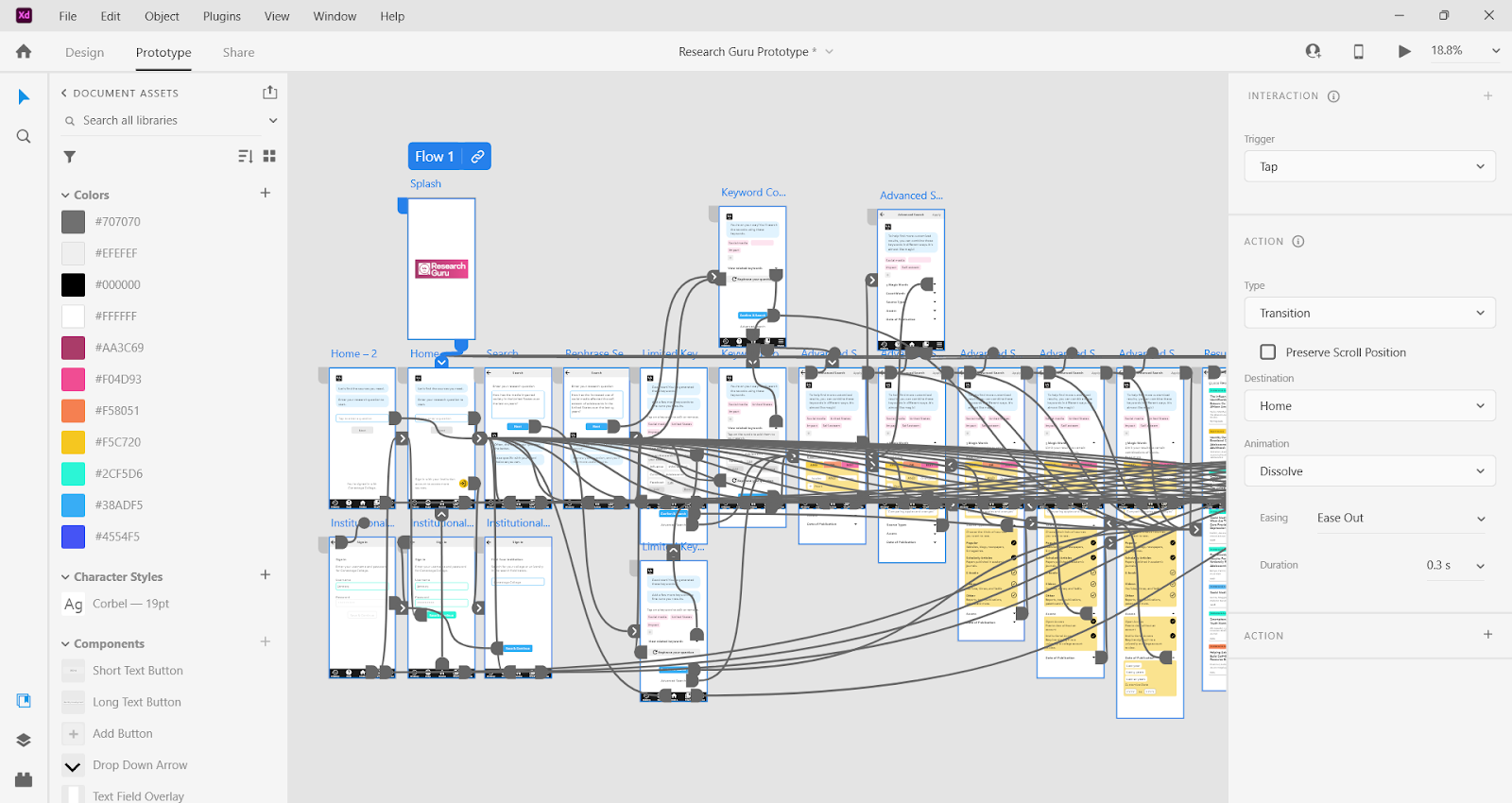
User Flow
I knew the user interactions in the app would be important, as the app is designed to tutor students. I asked myself What would users be thinking or need help with at each point they needed to make a decision in the app? The secondary reading I did earlier in my research helped me think about how the app could play that assistive role.
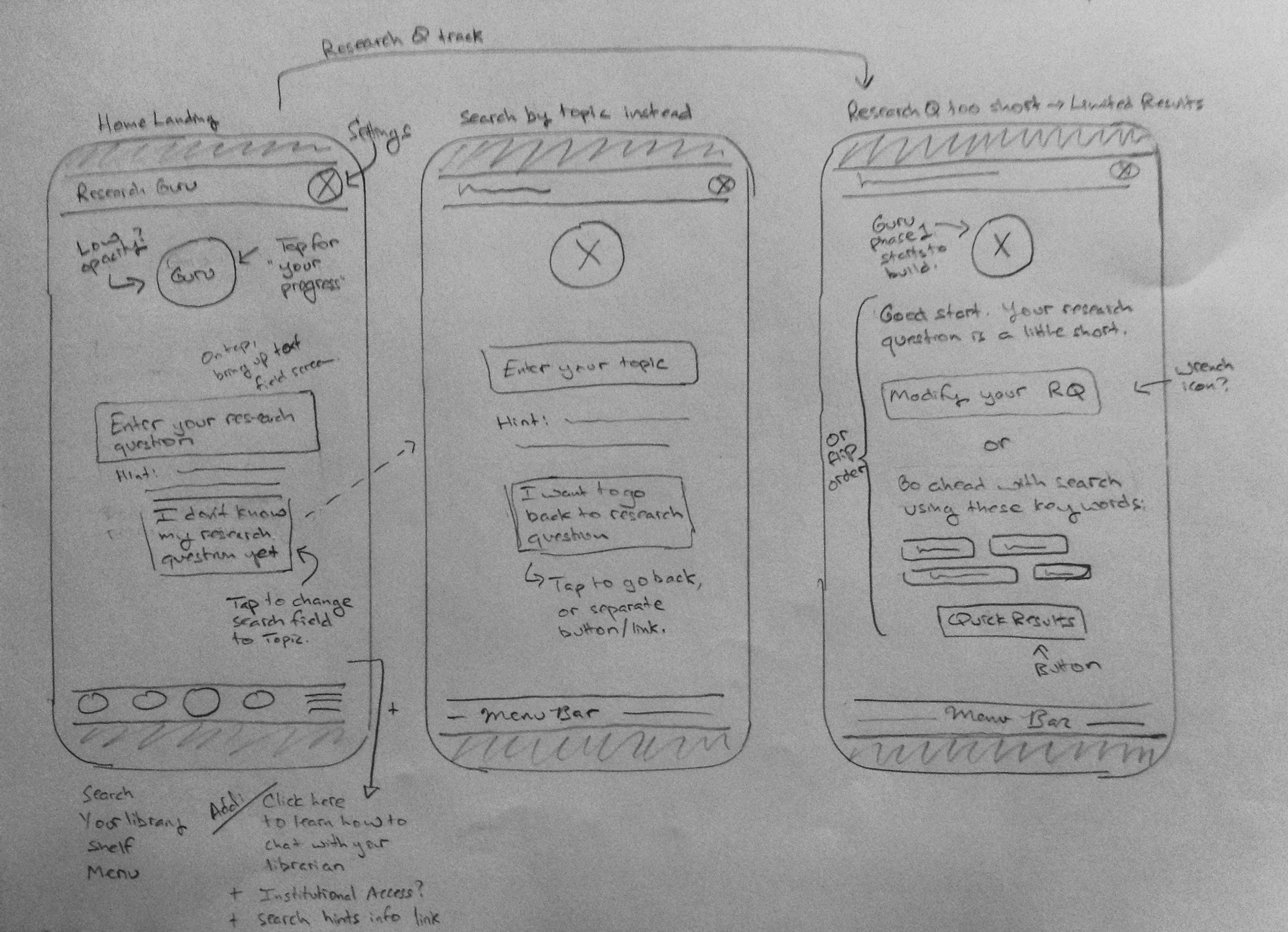
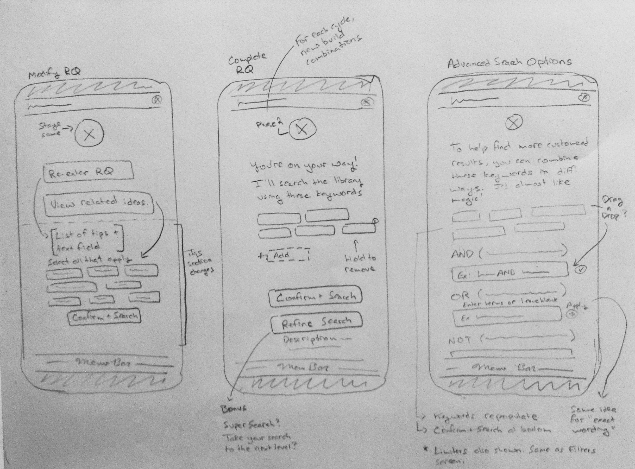
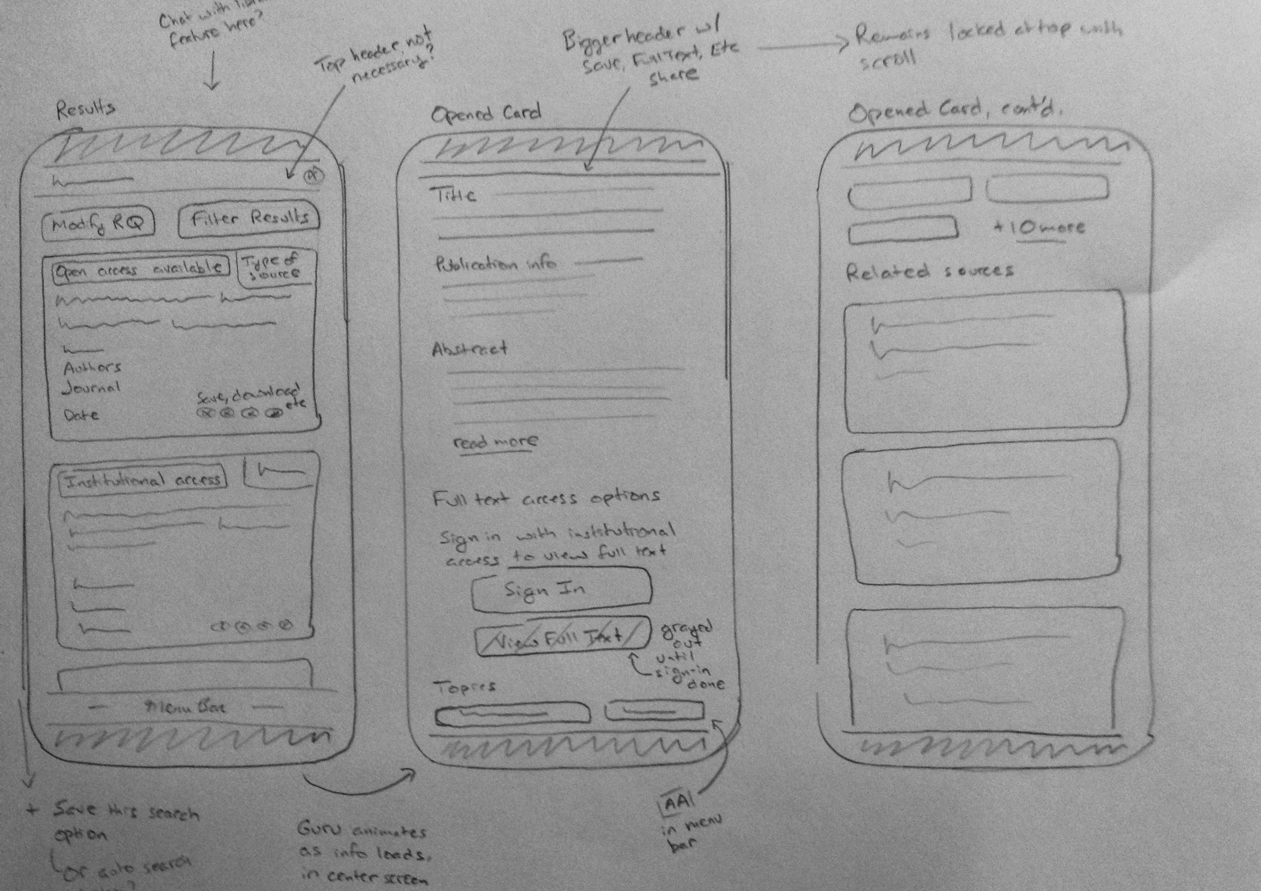
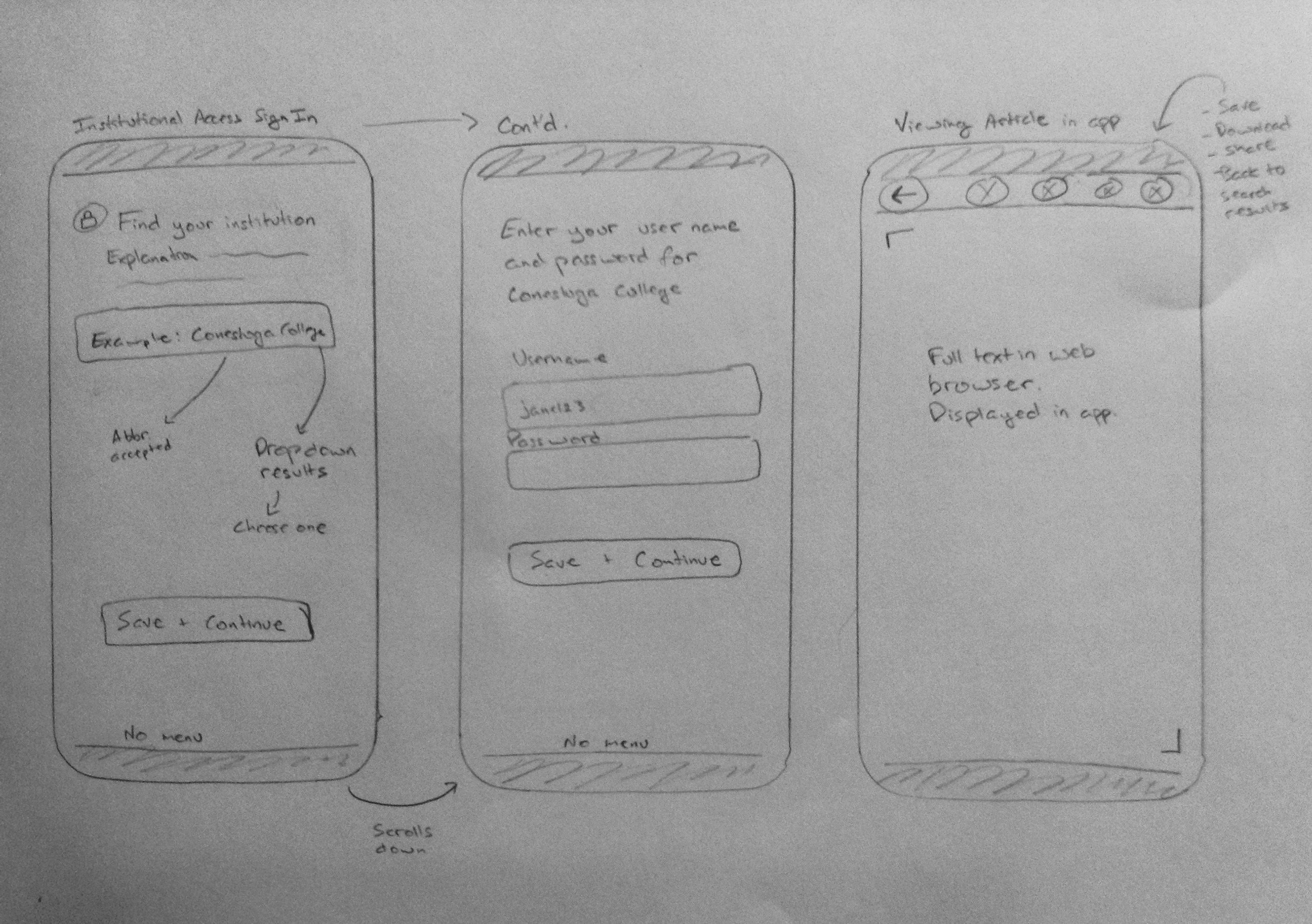
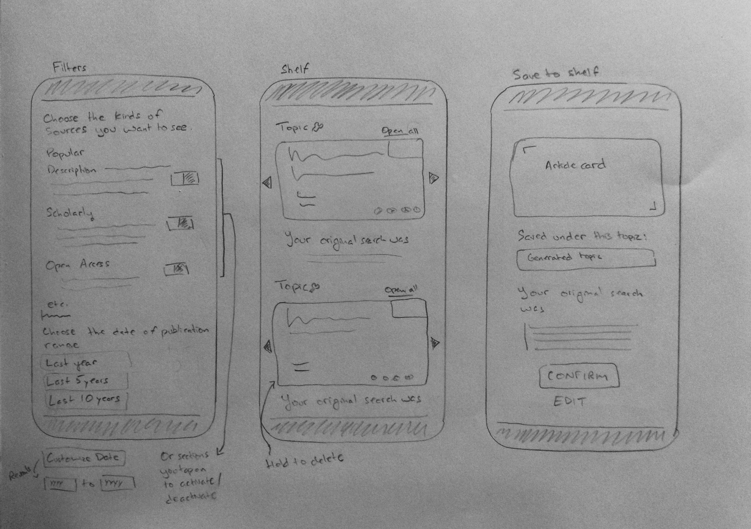
Low-Fidelity Wireframes
In these sketches, I worked out the information I thought was needed on each screen and the basic visual layout of that information. I also noted some of the interactions that would be a part of certain screens.
Medium Fidelity Wireframes
Once I had sketched the wireframes, I focused on the app's typeface, font sizes, spacing, icons, and navigation.
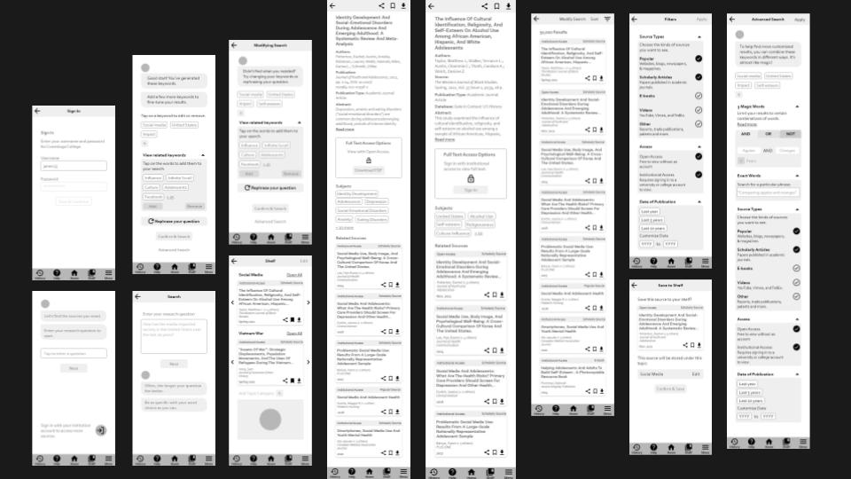
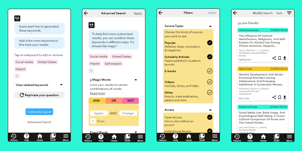
The Prototype in High Fidelity
Moving into high fidelity, I applied the colour scheme that I had worked out in my branding guidelines.
Next Steps
- Test the prototype for usability and to validate my assumptions.
- Gauge if the branding choices appeal to users and reinforce usability.
- If needed, make changes to the features and solutions I had chosen.
- Implement findings from usability testing into the next version of the prototype to improve interactions.
- Test again.
Reflections & Takeaways
This project was a big undertaking working on my own. Although this app is partly a redesign of a product that already exists, it also takes on the additional role of a tutor. The success of this app would depend on how approachable, desirable, and functional that tutor role is to students.
Some things I might have done differently
- Test at medium fidelity or earlier in order to test early, test often.
- Conduct some A/B testing with different branding choices with high school and college students to see which designs yield the most interest and best results.
- Create a user journey and develop my personas further.
Would you like to know more about this project?
This case study is an overview of the work I did for this project. If you're interested in learning more about this project, please contact me by email or through LinkedIn.