Zoofari
In this collaborative project, my team designed an app that seeks to enrich the physical experience of visiting a zoo through personalization and gamification. I led the team through Design Studio methods to help us meet our goals.
#Qualitative Research #Project Management #Design Studio #Mobile Prototype
Overview
Zoofari is an app that zoo visitors can use to plan their day and gamify their experience at the zoo. During research our team found that parents with kids needed a simple way to access scheduled events. And zoo visitors of all ages needed a fun way to learn about animals at their own pace. We designed a concept app that addressed these user needs with an eye for adventure and delight.
Role
- Project Management
- Research
- Wireframing
- Visual Design
Duration
- 6 Weeks
Tools
- Figma
- InVision
- Pen & Paper
- Trello
Methods
- Interviews
- Field Observation
- Competitive Research
- Design Studio
Process
The project began with research and continued with Design Studio activities to help us converge. As a project manager, I coordinated our team's week-to-week tasks and meetings. We used a Trello Kanban board to keep track of our progress and deadlines. While we all contributed to various stages of research and design, we chose to divide the workload and each focus our efforts on separate stages of design. Most of my energy went into research, but I also contributed to sketching, wireframing and mockups. Others in the group managed the low and high fidelity mockups.
Our Team: Jesse Irwin, Tee Kundu, Arham Kazi
Constraints
We worked on the project remotely from start to finish. Our meetings and collaborations took into account that one of our team members lives in India while we were working in Canada. We communicated in a WhatsApp group and Zoom meetings and worked synchronously on InVision and Figma.
Discover
We were given the task of building a prototype for an app that makes going to the zoo a more enjoyable and educational experience. We wanted to make something that would be both fun and useful, complementing the physical experience of the zoo.
To find our angle into this problem space, we performed competitive market research and qualitative research to identify user needs and begin the design studio process.
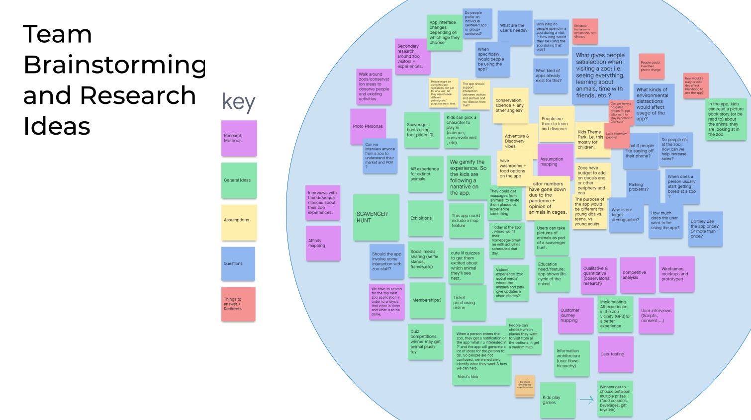
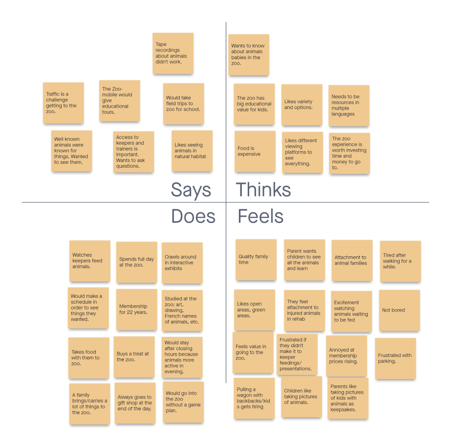
After a brainstorming session focused on research methods, assumptions, questions, and ideas, my team member Tee and I began research. This included an interview, analysis of existing zoo apps, and visits to both indoor and outdoor zoos. Based on this research, we created empathy maps and personas to keep our designs focused on user needs.
We uncovered a significant amount of information about user needs and habits for different age groups. Zoo visitors wanted a way to keep up to date with daily events at the zoo. They also wanted to feel like they had options. And, contrary to what we assumed, many didn't mind carrying their phones in their hand for long periods of time at the zoo.
My Interview
I interviewed a family of five—2 parents and 3 adult children—who used to live in Toronto and regularly visited the Toronto Zoo as part of their homeschool curriculum. The interview took place in the family living room. Most of my prepared questions were answered in the conversation that we had.
My Approach to the Interview
I phrased my questions based on examples from Starter Questions For User Research by Sarah Doody. My goal was to learn more about the pain points for a family with kids visiting a zoo and also what made zoo visits delightful so that our designs could address some of those frustrations and reinforce already existing positive experiences. The interview questions were investigating the validity of our assumptions about potential app features and user journeys.
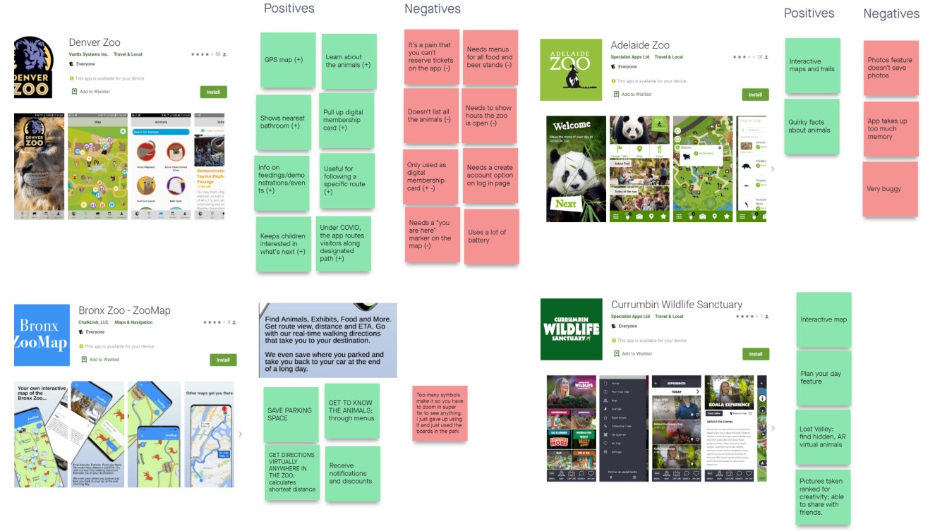
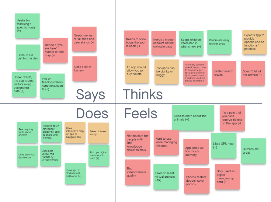
Competitive Research
I looked for zoo visitor apps already on the market on Google Play and the Apple App Store. Reading through reviews for each app, I made a list of positive and negative comments to help me identify user needs and pain points that our team could take into account in designing our own prototype.
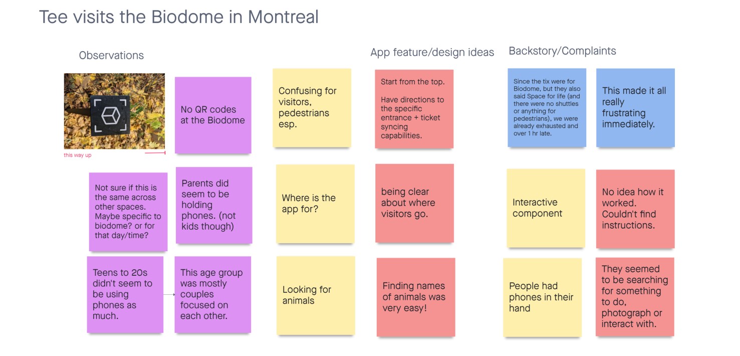
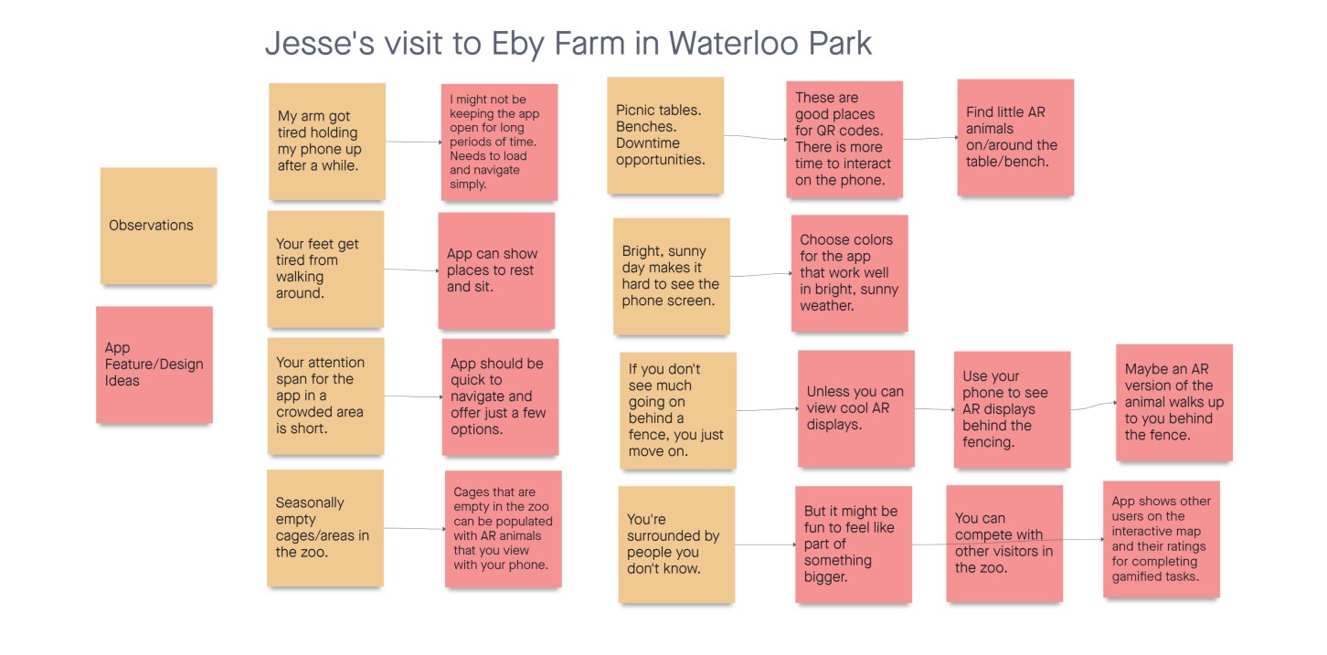
Field Observations: Zoo Visits
Tee and I each visited a zoo space to think about the intersections of an app user experience and the physical zoo experience. Tee visited the Montreal Biodome, and I visited the outdoor Eby Farm in Waterloo Park. Even though Eby Farm was empty for the winter season, I still came away with insights from my observations.
Empathy Maps
I made two empathy maps, drawing from my interview responses and from my competitive research, based on user review comments of other apps and on my interview responses. This helped me visualize who our users are and the pain points they face in existing user journeys.
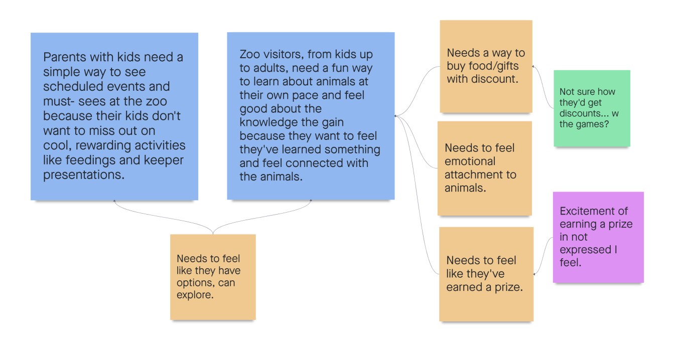
User Needs
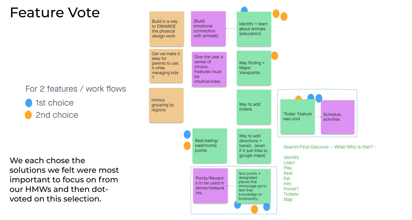
I discovered many user needs from my preliminary research. To avoid overlooking any user needs, however small, I listed as many as I could, generating over 30. Later, I grouped as many of those needs together as I could, creating two bigger-picture needs, shown in blue below.
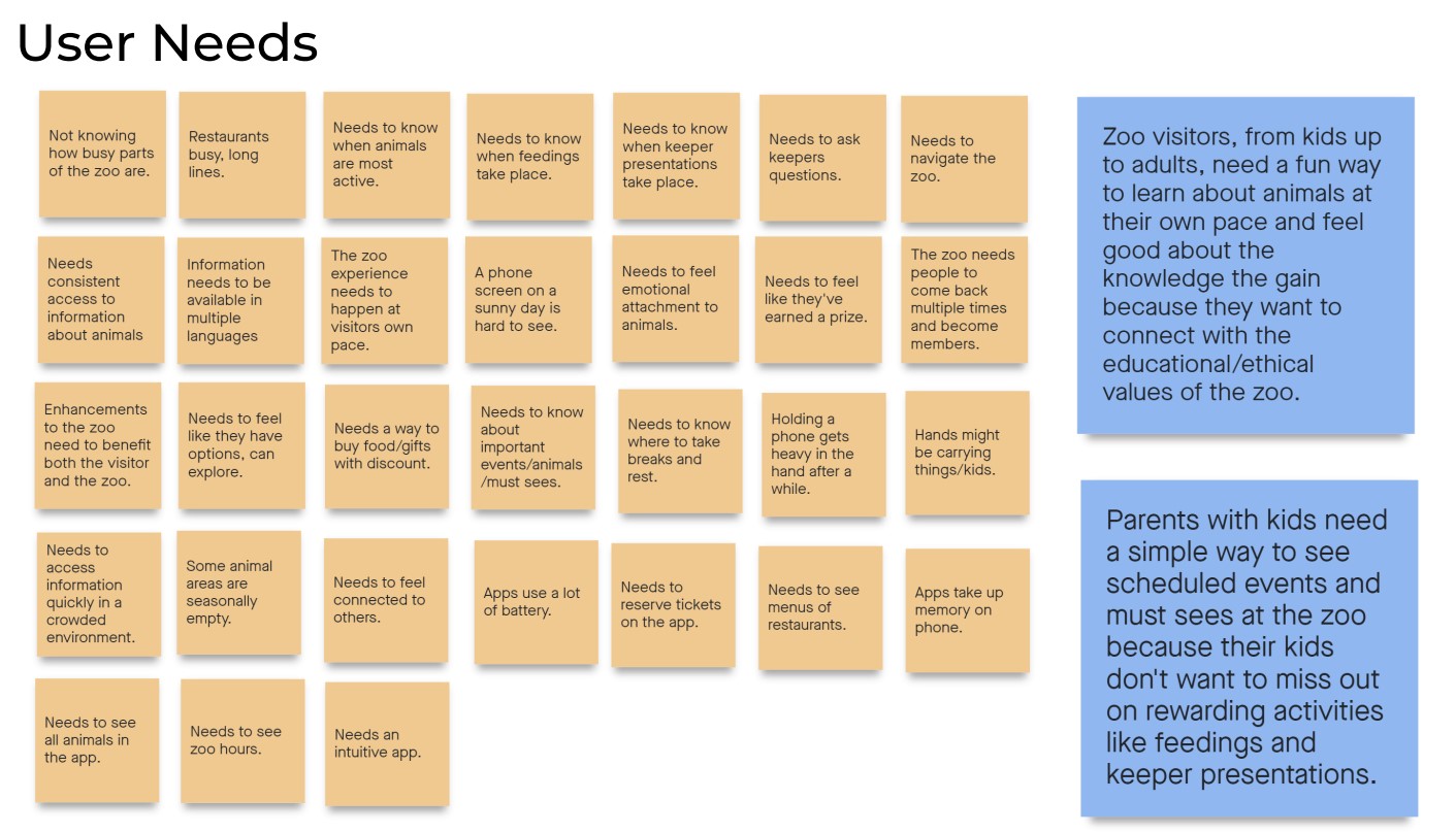
Problem Statements
I considered the many user needs from our research and wrote two problem statements that our prototype might focus on. In addition to those two problem statements, I wanted to include related, satellite user needs that would inform smaller design decisions.
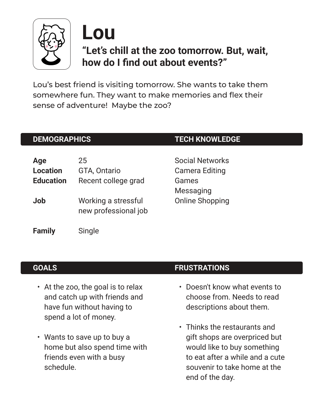
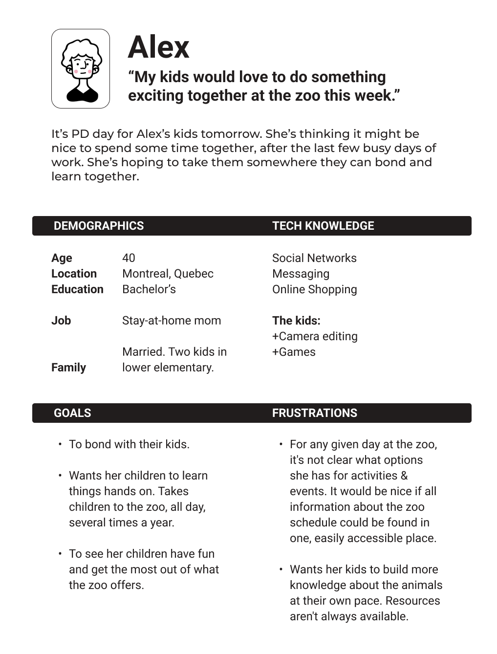
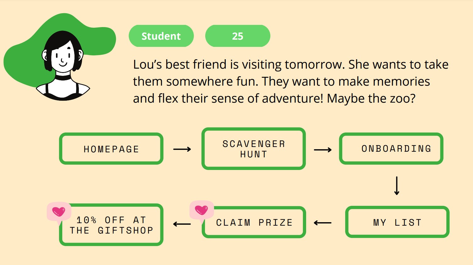
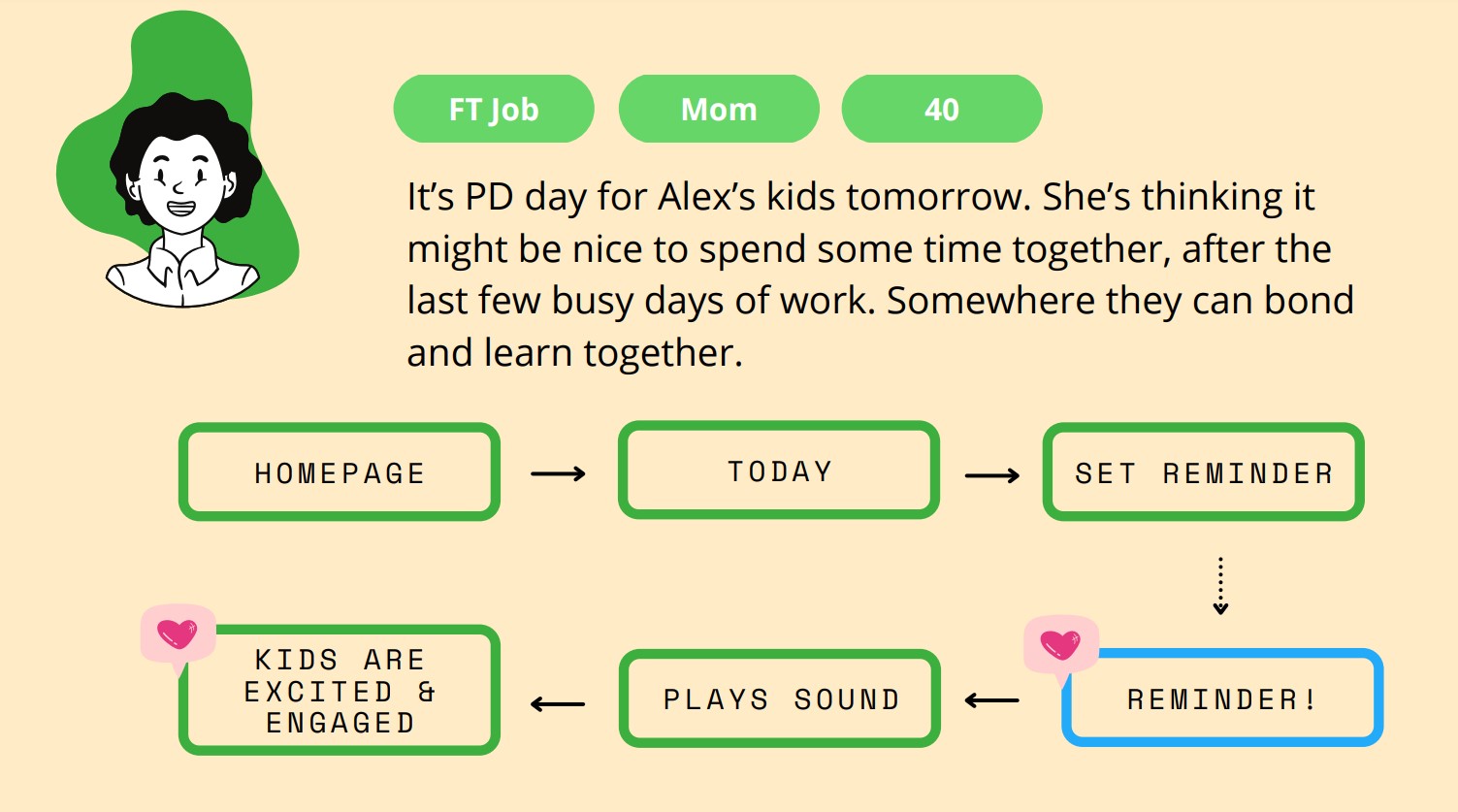
Personas
Tee and I drafted two user personas that correlate with our two problem statements. These personas reflect two types of users: young professionals looking to have a fun day out with friends and a parent with kids visiting the zoo.
Moving Toward Our Prototype Design
- Because the zoo can be a chaotic environment, and because kids would be using the app, we wanted the design to be simple and playful.
- Because users might be using the app multiple times during the day or over multiple zoo visits, we wanted the app give them options for their day.
These considerations led us to design the Today feature and the personalized Scavenger Hunt.
Explore
As project manager, I organized design studio activities that would help the team converge on understanding the problem space and designing solutions that would address user needs.
How Might We Questions
To help our team narrow our scope for the project, I turned user needs into how might we questions. Then, I grouped the HMWs into broader categories. Team members then chose certain categories they felt were important to pursue.
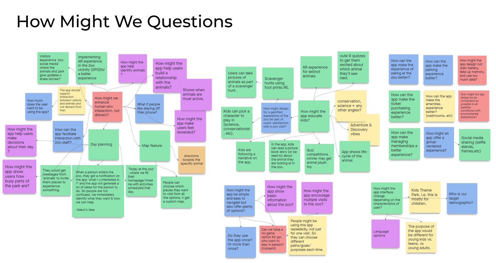
Dot Voting
Our team dot voted on the HMWs that we had individually chosen. The two features that garnered the highest priority were a scheduling tool and educational quizzes.
Build
After voting on solutions, we designed a clickable prototype, getting there by creating sketches, wireframes, a user flow, user stories, and branding guidelines. Tee and Arham took the lead on this phase of the design process, while I helped as needed.
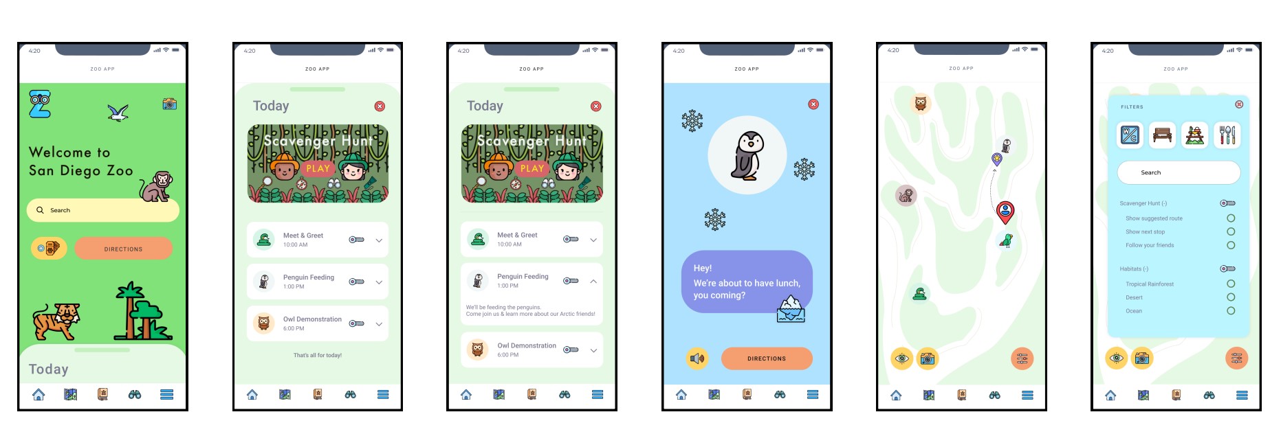
The Features We Chose to Build
"Today" Event Scheduling and Reminders
A tab on the homescreen takes users to a list of events occurring on any given day at the zoo. Users can select the events they plan to attend, and the app will notify them when it's time to make their way to the event.
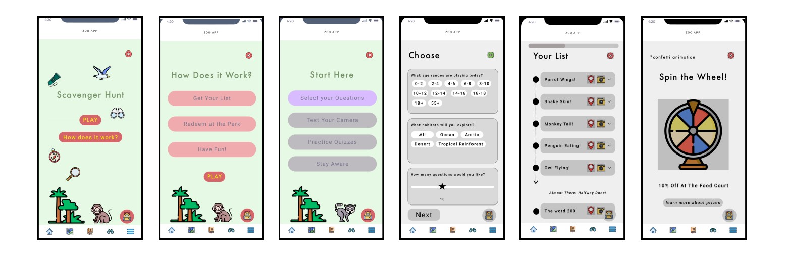
Scavenger Hunt
Users receive personalized lists of scavenger hunt goals in their "List" based on the scavenger hunt onboarding process. The backpack icon lets users access tools they need for the game, such as the camera. Once users have completed all the goals on their lists, they receive a chance to win a discount at one of the restaurants or gift shops in the zoo.
Navigation Map
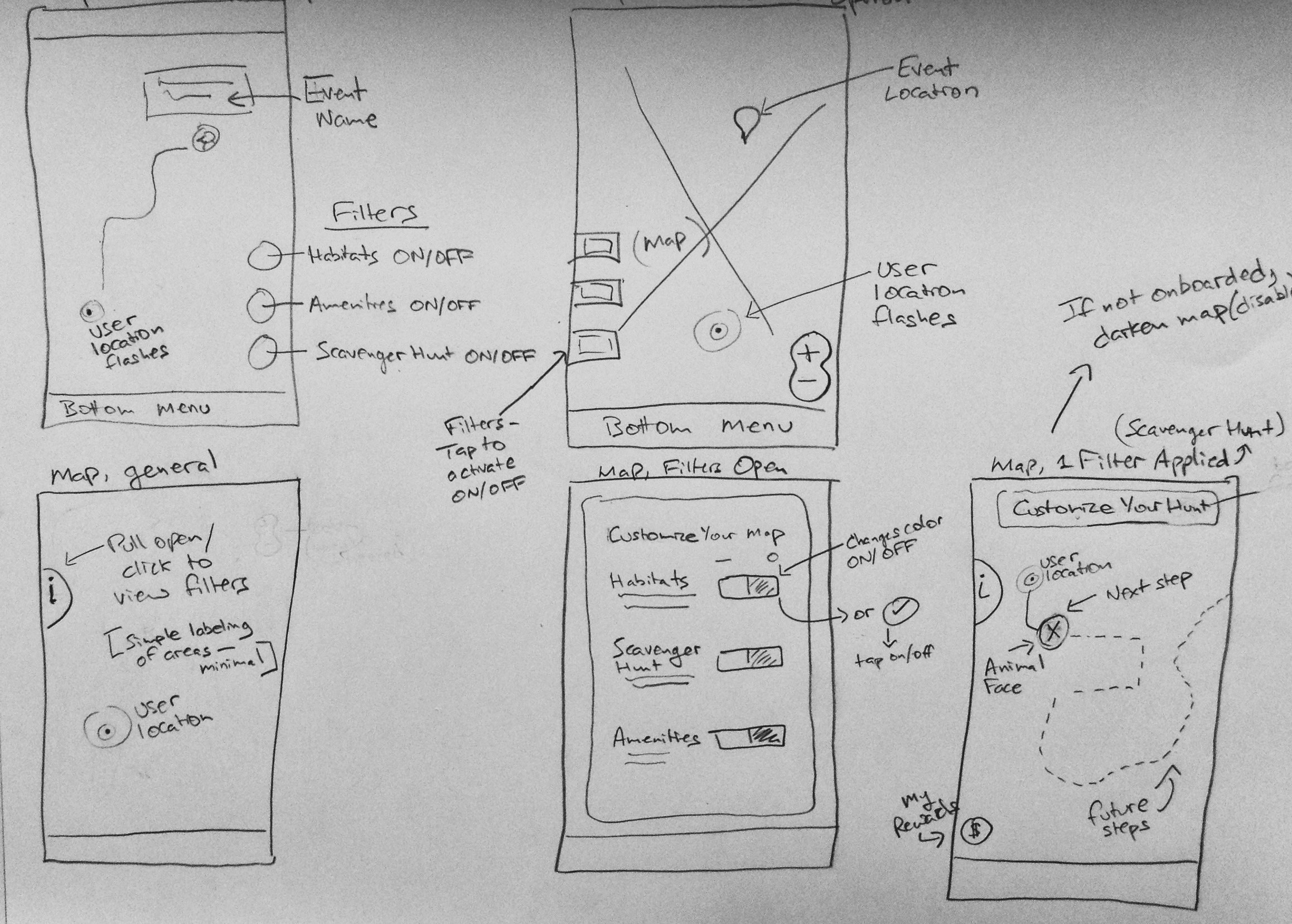
All roads eventaully lead to the map. This features works both with the "Today" and Scavenger Hunt tools on the app, showing were users are currently located and their next destination. The map is also customizable—a filter button brings up a list of options that enhance the Scavenger Hunt experience and show the user essential facilities and areas of the zoo.
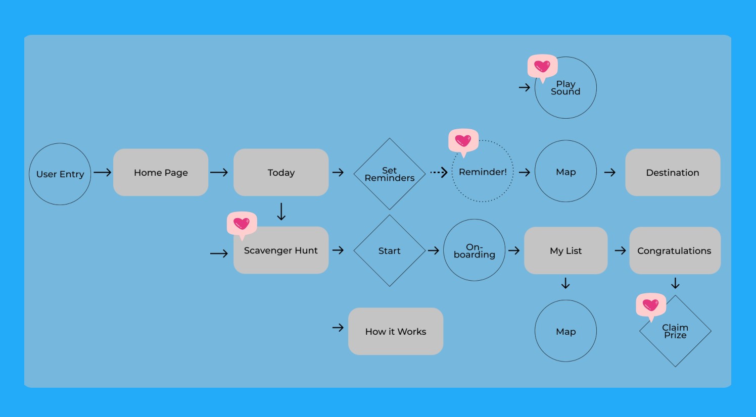
User Flow
This diagram describes how users move through the two main features of our prototype.
Sketches
I sketched out the navigation map as it would look for zoo navigation and the scavenger hunt. We wanted to make the map customizable. Thus my experimentation with filter buttons.
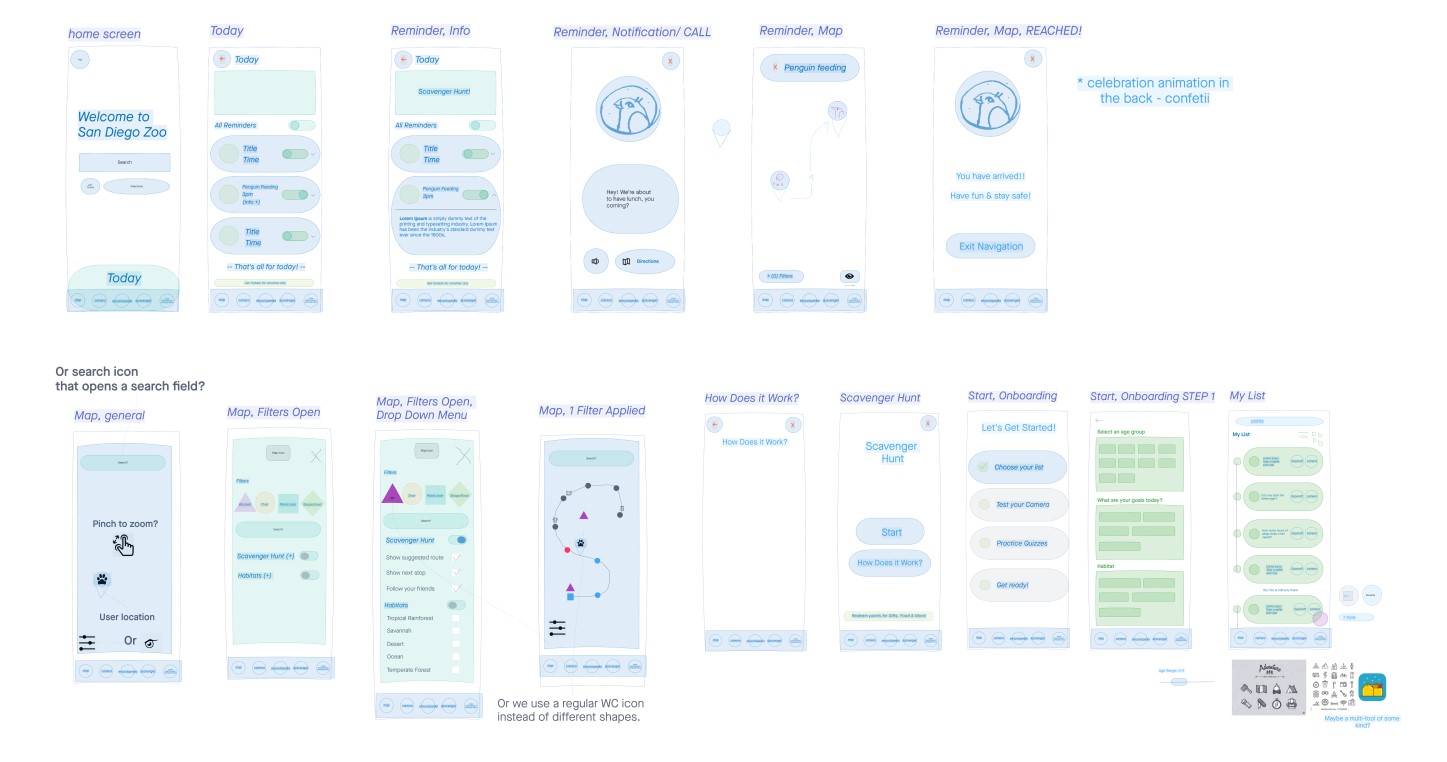
Low Fidelity Wireframes
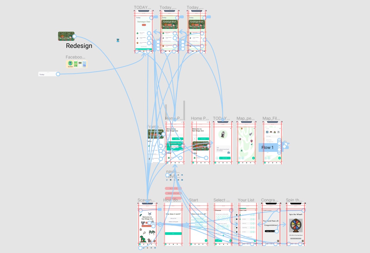
We converted our sketches to low fidelity wireframes on InVision. This helped us generate ideas for visual design, interactions, and the hierarchy of information.
High Fidelity Mockups
At this stage, we applied typography, colour, and other visual design elements to our wireframes.
User Stories
Tee created these user stories that explain how our personas would interact with the two features we built out in the prototype.
Our Clickable Prototype
We built two task flows to demonstrate key functionality for the solutions to our original two problem statements. We used this prototype to demonstrate the app in a pitch to two product designers.
Our Child-Focused Design: On the Edge of Losing Certain Users
In response to our presentation of this project to UX designers, we received feedback that the child-like aesthetic of the app may turn off some potential users. Overall, the designers were excited about the app and its potential.
Next Steps
- Test the prototype for usability with partipants who are like our personas—young parents, kids, and young professionals—in order to validate our assumptions.
- Improve on the features and solutions we had chosen.
- Implement findings from usability testing into the next version of the prototype to test again.
Reflections & Takeaways
- Our app is designed to work for zoos in general, not a specific one. I think, if this project were to move forward, we would need to choose a specific zoo to design for, customizing the features for the needs of that particular zoo and its visitors.
- The prototype demonstrates two task flows—given more time, our next step would be to design a more developed user flow and conduct user testing.
- We might modify the aesthetic of the app to be more relatable to zoo visitors without kids. It would be helpful to do A/B and usability testing to learn if users prefer playful or less playful.
Would you like to know more about this project?
This case study is an overview of the work I did for this project. If you're interested in learning more about this project, please contact me by email or through LinkedIn.